Month: October 2025
Do you know that the very first moments after downloading an app – including how you handle app permission requests – determine whether users will become loyal customers or hit the uninstall button?
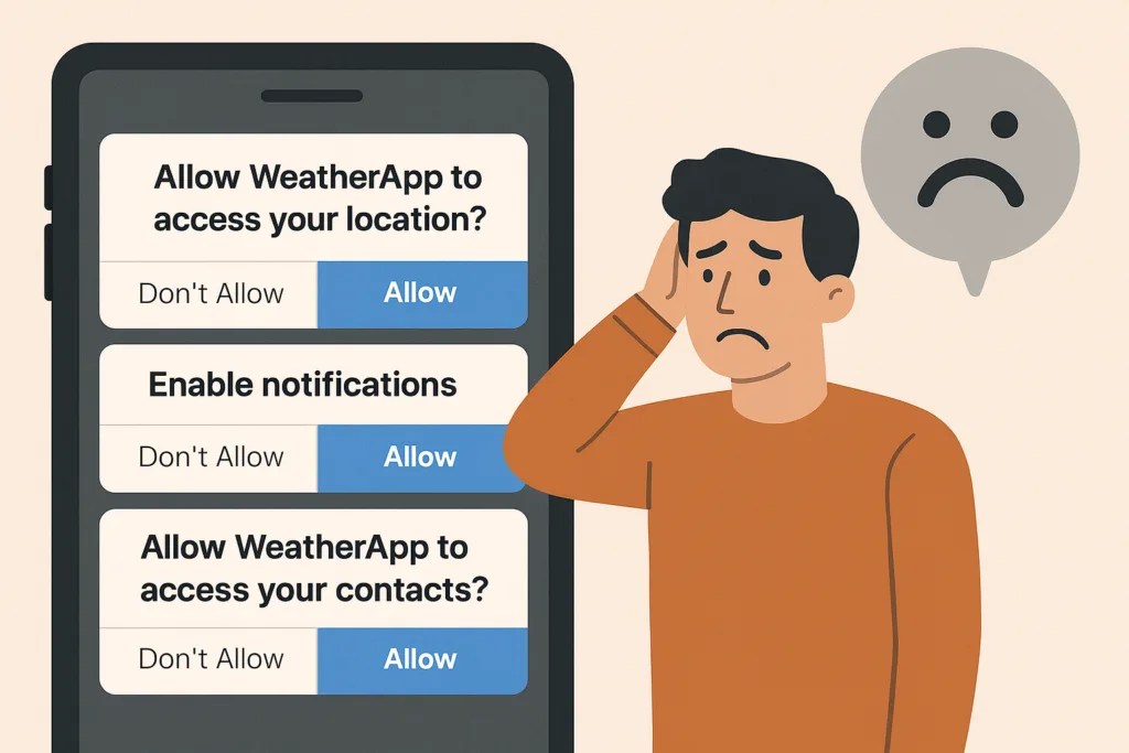
If they’re instantly hit with pop-ups like “Allow access to your location,” “Enable notifications,” or “Rate us 5 stars,” trust evaporates – and so do your users.
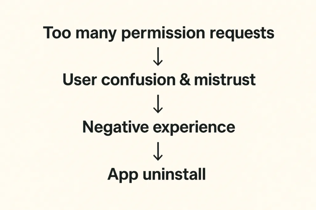
When apps request too many permissions too soon, users fear privacy invasion and data misuse.
For instance, if a weather app asks for camera and microphone access before showing any forecast, users will likely delete it.
This article explores the psychology behind app permission requests and explains how to turn potential frustration into loyalty.
This article delves into the psychology of customers and reveals the best ways to turn them into loyal users rather than drive them away.
The problem: Why app permission requests can destroy user trust
Imagine opening a weather app just to see the forecast. Before anything loads, you face a stack of prompts: location access, notifications, ratings – all in 30 seconds.
You’d feel overwhelmed and suspicious. That’s how 45% of users feel before uninstalling apps that bombard them with early permission requests.
Recent studies reveal:
- 45% of uninstalls are due to unclear permission requests
- 72% of users delete apps they perceive as unsafe or intrusive
Users want control. When apps ask for too much too soon, they lose trust – and you lose retention.
Recent research shows that 45% of app uninstalls stem from unclear permission requests or mistrust around data usage. And things get even worse when apps require access to contacts, camera, microphone, or location without context. Modern app users are increasingly privacy-conscious – another survey indicates that 72% of users won’t hesitate to uninstall apps because they fear their personal data will be misused.
How can we avoid these pitfalls?
The solution: How to make app permission requests contextual and user-friendly
The answer is to ask less – and ask smarter. When developing an app, we always try to align permission prompts with user actions and needs:
- Request permissions only when needed. Smart apps wait until the user tries to use a feature before requesting the permission. For instance, a weather app can ask for location only when the user taps “Find local weather”. This contextual approach feels natural and respectful.
| Real-life example: Instagram doesn’t request camera access during onboarding. Instead, it waits until users tap the camera icon to create their first post. At that moment, the permission request makes perfect sense — users understand exactly why it’s needed and what benefit they’ll receive |
- If a permission is critical upfront, educate the user first. Some apps do need a core permission from the very beginning – for example, a navigation app genuinely cannot function without GPS location. In such cases, it’s ok to ask for location early but in the right way: clearly communicate why you need this access and how it benefits the user.
| Real-life example Starbucks demonstrates sophisticated contextual permission design by explaining how location access enables timely offers when users are near stores. By linking the permission directly to tangible benefits (personalized promotions at the right moment) they achieve significantly higher acceptance rates. |
- Space out requests and prioritize the essentials. Avoid piling on multiple prompts back-to-back. If you need several different permissions, consider their importance and timing. Ask for the most crucial one first and save less vital ones for later when relevant.
- Give users control over notifications. Notifications are useful for engagement if done right, but a top reason for uninstalls if overdone. The best practice is to let users decide the kind of notifications they want and how often. Inside your app’s settings, provide toggles or preferences – for example, the user could choose to receive daily summary alerts, severe weather warnings only, or no notifications at all. This way, users will feel the app respects their attention and needs.
- Ask for app ratings and other opt-ins at the right moment. A common mistake is prompting for an app store rating too soon – sometimes on first launch. Instead, time your rating requests to when a user has achieved something or shown satisfaction. For example, after a user has checked the weather for a week straight or engaged with multiple features, a gentle pop-up like “Enjoying the app? Tap to rate us!” is more likely to be well-received.
In essence, our solution is about respecting the user’s journey.
The framework: Best practices for handling app permission requests
For development teams, implementing such a permission strategy requires a systematic approach. Here’s our framework on how to do it right.
| Audit phase | List every permission your app requestsIdentify which are essential vs. nice-to-haveDetermine the exact moment each permission becomes necessary |
| Design phase | Create custom pre-permission dialogs explaining the “why”Design fallback experiences for users who deny permissionsImplement progressive onboarding that defers non-critical requests |
| Testing phase | Monitor permission acceptance rates by type and timingTrack correlation between permission requests and uninstallsGather user feedback on permission explanations |
| Compliance phase | Ensure all requests comply with App Store and Play Store guidelinesDocument data usage clearly in privacy policiesProvide easy-to-access permission management settings |
Key takeaways for developers:
- Request permissions contextually, at the moment users need the related feature
- Provide clear, benefit-focused explanations before system permission dialogs
- Design graceful fallbacks for users who deny permissions
- Monitor acceptance rates and uninstall correlations to optimize timing
- Enable user control through in-app permission management settings
Conclusion: Ask permission when the benefits are obvious
Request permission when users understand the value, not when it’s convenient for your code architecture.
This core principle transforms annoying permission requests into opportunities – moments to demonstrate respect for user privacy while showcasing your app’s value. Ask for permission when the benefit is obvious, explain why it matters, and respect their decisions. When users feel that you’re not spamming them with tricky notifications, they reward you with loyalty… and yes, maybe even that 5-star rating when the time is right!
At DreamBit, we can help you design an app that feels intuitive, respectful, and transparent from the very first tap. So, let’s build an app your users will want to say “Allow” to!
Teaser: extra steps = lost customers.
Imagine this scenario: your potential customer has already chosen a product, added it to their cart, and is ready to pay – then suddenly disappears. Sound familiar? This is exactly why finding ways to reduce cart abandonment has become a top priority for every e-commerce brand.
According to the latest research, 70% of online shopping carts are abandoned, and on mobile devices, this figure reaches a staggering 85%. The biggest loss occurs precisely at the checkout stage – almost 1 in 5 shoppers quit because the checkout is too long or complex. Nearly as many drop out when a site forces them to create an account.
The truth is that every unnecessary step on the path to purchase is lost money.
We took this to heart when analyzing one of our e-commerce app projects. The goal was clear: simplify the checkout flow to remove friction. By doing so, we managed to plug a big leak in the funnel and cut the cart abandonment rate by about 20%.
The problem in detail
Before sharing our solutions, let’s explore the typical problems users face during checkout in most e-commerce applications.
The checkout stage is where most brands fail to reduce cart abandonment, mainly due to friction and unnecessary steps.
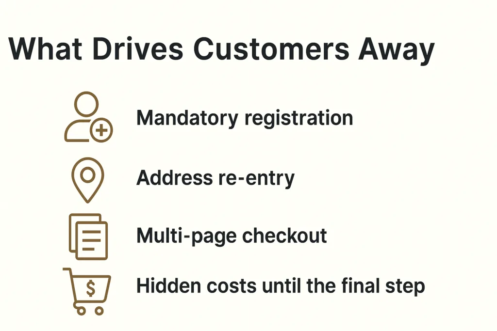
Mandatory registration
Baymard Institute research shows that 24% of users are ready to abandon their cart if the app requires creating an account. When you remove mandatory registration, you can save many more customers. Why? Customers want to quickly buy a product, not create another account with a password they’ll forget in a week.
Address re-entry
Many platforms force users to enter their shipping address, and then enter it again for billing. Even when addresses are identical, the system doesn’t offer automatic copying. This creates frustration and increases checkout time.
Multi-page checkout
Traditional 3-4 page checkout processes force users to click “Next” multiple times, wait for each page to load, and never see the finish line. Every click is an opportunity for the user to change their mind.
Hidden costs until the final step
48% of buyers abandon their cart due to unexpected costs. When these costs appear only on the final checkout page, it creates a feeling of deception and leads to immediate abandonment.
Our Solution: Minimalism That Helps Reduce Cart Abandonment
At DreamBit, our UX improvements directly helped reduce cart abandonment by simplifying the checkout flow and removing friction points.
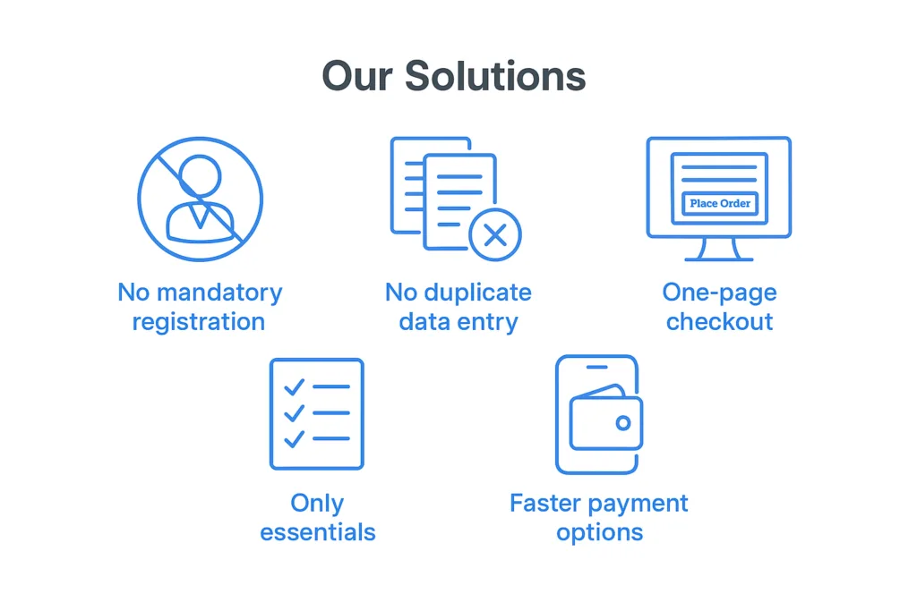
No mandatory registration
We remove the “create an account” roadblock. New customers can check out as guests without signing up. We still collect an email for receipt and allow account creation after purchase, but we no longer force it upfront. This can remove a huge barrier for first-time buyers. What’s more important: making a sale or making a user account? Obviously, the sale.
This change alone can have a significant impact – even industry leaders like ASOS saw 50% more customers complete checkout after they added a guest checkout option. We follow the same principle so that nothing stops a willing customer from paying.
No duplicate data entry
Many apps force users to enter their shipping address, then re-enter it as a billing address (unless they notice a tiny checkbox). We fixed that by defaulting billing = shipping and only asking for an address once. Customers can still adjust it if needed, but the typical buyer now fills out a single address form one time. We also typically enable address auto-complete to speed this up.
By eliminating redundant forms, we shave off an entire page of the checkout process. Fewer form fields means less friction – Baymard Institute’s research shows an ideal checkout only needs about 7–8 fields, yet the average app’s checkout has around 15 fields. We took that lesson and ran with it, asking only for the essentials: shipping info, email, and payment details. Nothing more.
One-page checkout
We consolidated multiple steps into a single page. Previously, our checkout was split into separate pages for shipping, payment, review, etc., each with its own load time and chance to drop off. Now, it’s all presented in one cohesive page (on one screen in the app). The moment a user decides to check out, they see a one-page form where they can enter an address, choose shipping, input payment, and hit “Place Order”. There’s no clicking “Next” and waiting for another page to load.
This streamlined UX makes the process feel faster and simpler. In fact, reducing the number of steps/screens directly boosts conversion. Our apps simply don’t give users a chance to second-guess with extra clicks.
Only essentials
Beyond the big structural changes, we scrutinize every element on the checkout screen. Anything not essential to completing the purchase can be cut. We often remove promotional banners, navigation menus, and any links that could divert the user’s attention. This way, the checkout page turns into a focused, distraction-free zone – essentially a dead-end whose only way out is a successful order.
No more “About Us” links or product recommendations to lure users away at the last moment. We also drop optional fields like “Company Name” or survey questions that could be nice-to-have for us but roadblocks for the user. The checkout UI should be clean and minimal, asking only what’s needed to get the order in the books.
Faster payment options
We integrate one-tap payment methods like Apple Pay and Google Pay. These let users skip the manual entry of card details and billing address entirely, if they choose. Offering such express checkout options further streamlines the experience – for instance, adding digital wallet payments can significantly lift conversion rates (one study noted a 10.7% increase after adding an express payment option).
In our case, a large portion of the app’s users are on mobile, so enabling Apple/Google Pay means many can check out with literally a single tap using stored credentials. The checkout went from a laborious form to a one-click affair.
Improvements at a glance
These changes clearly demonstrate how a focused approach to reducing cart abandonment impacts conversions and checkout speed.
| Before changes | After changes | Improvement | |
| Cart abandonment rate | 68% | 48% | -20% |
| Checkout conversion | 54% | 65% | +20% |
| Checkout completion time | 4.2 min | 1.8 min | -57% |
| Mobile conversion | 2.1% | 3.4% | +62% |
The bottom line: The best checkout is an invisible checkout
The best checkout experience is invisible – one that naturally reduces cart abandonment and helps customers complete their purchase effortlessly.
In a world where user attention costs more than advertising budget, every second in checkout is critically important. Our experience shows that removing even one unnecessary step can increase conversions by 5-10%.
The best checkout is one that users don’t notice. They simply buy the product and enjoy the process.
If your e-commerce project needs similar optimization, DreamBit is ready to help create a checkout that converts visitors into customers.