Teaser: Trust begins with consistency
First impressions happen fast – about 50 milliseconds is enough. In that blink of an eye, an inconsistent or chaotic interface can trigger a negative reaction and send users away from your app.
Think about it: if one page of your app looks sleek and modern, but the next is made in mismatched colors and fonts, users immediately feel something is off. Design consistency isn’t just about aesthetics; it’s about making your audience feel comfortable and confident in your brand. If your branding is “all over the place,” customers won’t trust you – and if they don’t trust you, they won’t buy from you.
Maintaining a cohesive, well-organized design is key to turning users into loyal customers. Just as we instantly recognize the familiar colors and fonts of brands like Apple or Nike, a consistent design can help people recognize and trust your brand at a glance.
The Problem: When Design Chaos Reigns
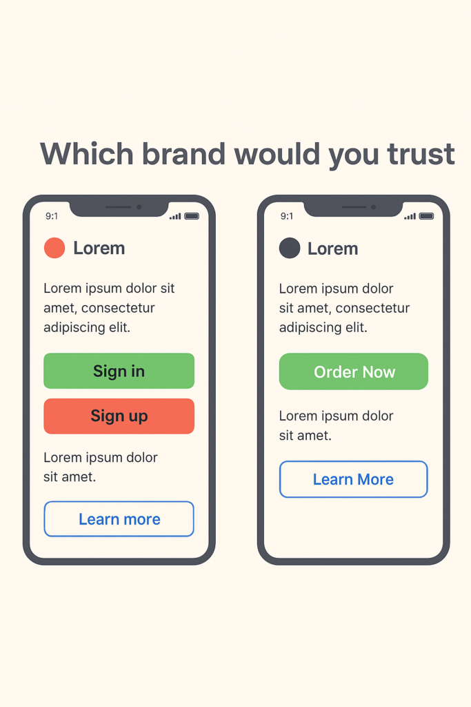
Imagine an app that has the large green oval “Order Now” button on the home screen. But on the checkout screen, it offers a small red square button for the same action. On one page, icons are flat and minimalist; on another, they’re detailed and colorful. It feels like each part of the app was designed by a different team that never spoke to each other. Yikes!
Inconsistent design forces users to stop and second-guess, figuring everything out again instead of moving forward smoothly. Over time, this confusion breeds frustration. One UX expert described it perfectly: “If every button and menu behaves differently, the user must constantly relearn how to interact with the app. Predictability – a critical aspect of usability – is lost. When users can’t rely on familiar patterns or a stable layout, they feel uneasy and even alienate”.
Worst of all, inconsistency erodes trust in the product. People perceive a sloppy interface as a sign of unreliability. It makes your app (and by extension, your company) seem unprofessional. Studies in UX design reveal that a cluttered design can make your product feel unreliable. Users might wonder, “If they can’t even get their app’s look and feel together, can I trust them with my order or my data?” That doubt can be fatal.
Confused and unsure, users may abandon the app entirely and go to competitors that “feel” more put-together. As a result, you may end with lost users, lost sales, and a damaged reputation.
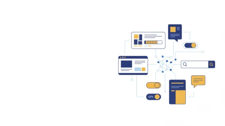
Our Solution: Consistency Through a Design System
So, how do you prevent this kind of design chaos and ensure every interaction with your brand inspires confidence? The answer is simple but powerful: implement a comprehensive design system.
At Dreambit, we are big believers in this approach. In fact, when kicking off a new project, we insist on creating a design system right from the start.
A design system acts as the ultimate rulebook and toolkit for your brand’s visuals and user experience. It typically includes defined standards for typography, color palettes, icon styles, spacing, button designs, and more – basically, all the building blocks of your UI. It can also cover UX rules like how certain interactions should behave or how error messages should appear.
In short, it’s a holistic guide that ensures every piece of your product’s interface is consistent, from the smallest icon to the entire layout.
By establishing a design system, you create a unified visual language for your brand. And when users navigate your app, they encounter a predictable experience: every page looks like it belongs to the same family, every element behaves as expected. As a result, the whole app feels professional and reliable, which naturally strengthens your brand’s reputation.
There’s another huge benefit to using a design system: it saves time, money, and countless headaches in the long run. Without a clear system, teams often waste their resources reinventing UI elements or correcting mistakes.
We’ve all seen projects where a lack of standards leads to “design debt” – dozens of slightly different buttons and layouts that eventually all have to be fixed or unified in a costly redesign (even minor changes require updates across multiple unique components). This is the scenario we desperately want to avoid.
When you invest a bit of effort upfront to create a well-thought-out system, you save your time, money, and effort on endless revisions in the long run.
Another point to note is that having a design system doesn’t mean your design will be boring. On the contrary, it frees up your creative energy for what truly matters. Instead of spending time deciding basic things over and over, your team can focus on unique improvements.
Conclusion: Design Systems – Not a Constraint, but a Worthy Investment
Chaos in design is a silent killer of customer confidence in your brand. Every inconsistent button, odd color switch, or off-brand page makes users hesitate and doubt.
We’ve seen that trust is hard to earn and incredibly easy to lose. The good news is that chaos is avoidable. By prioritizing consistency through a design system, you lay the groundwork for a user experience that feels smooth, reliable, and true to your brand on every screen.
Ultimately, a design system is not about putting your design in a cage. It’s an invaluable investment in speed and quality – you streamline your design and development process, while ensuring a higher quality, more polished result every time.
At Dreambit, we help businesses build products that don’t just look great but inspire trust through consistency. Get in touch with us to make something meaningful together.
Don’t stop here! Check out our other blog posts for actionable tips on improving your app’s UX, boosting conversions, and delighting users → Read More