
Field notes on building mobile & web products — what we learn shipping software for founders, and the strategy behind it.

SaaS product development for web and mobile is not just about choosing between platforms. It is about designing an ecosystem where every user, every device gets the right interface for the right moment.
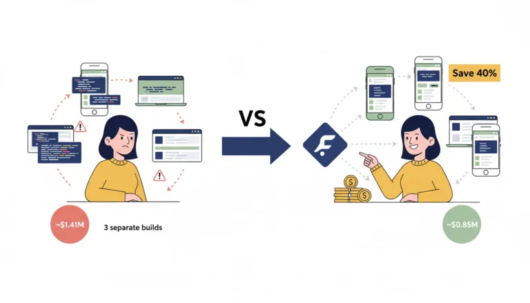
If you're a wellness founder or product owner, you've probably felt this tension: you want your app to look premium and feel safe (because you're dealing with habits, health, maybe even sensitive data), but every new feature request multiplies cost and time.
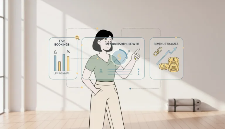
Data-driven wellness helps wellness studio owners see revenue leaks before they become end-of-month problems. Instead of relying on delayed reports, studios can track bookings, cancellations, memberships, and client behavior in real time, turning daily operations into measurable growth.
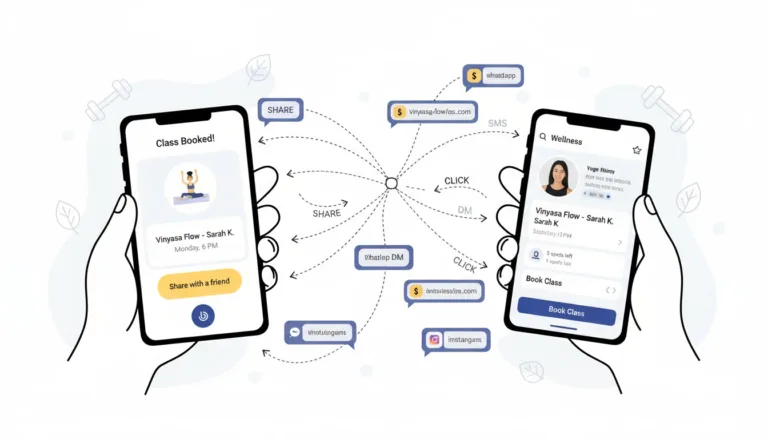
Shareable links for wellness apps can turn every class, trainer […]
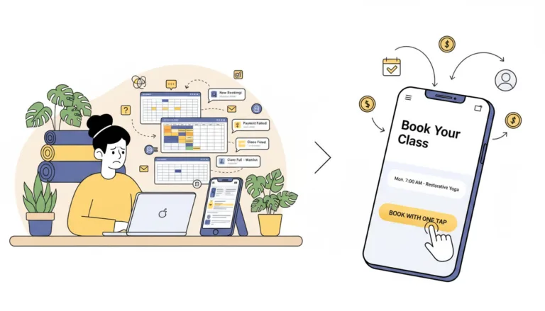
If you run a network of three or more yoga studios, your biggest challenge is often not attracting new students. The real problem is managing them efficiently with the right yoga studio booking software. Many growing studios rely on tools that create friction instead of helping them scale.