LTV +20%: How We Turned the Cancellation Screen Into a Monetization Engine

This article is a cancellation flow case study that shows what really happens when a customer tries to leave – and how that moment can become a growth opportunity.

Picture this: a subscriber opens your app, heads to their account, and taps “Cancel Subscription.”
Most companies treat this moment as the end of the road. For them, it means a lost customer.

But should it be?
Some users will always unsubscribe, but you should not let it happen without at least trying to understand their decision. You also should not miss the chance to offer something valuable in return.

At Dreambit, we asked ourselves a simple question:
What if the very screen where users go to leave could convince them to stay?

This idea turned into a system that allowed us to convert an “exit” into an “upsell.”
And it worked.
By creatively monetizing the unsubscribe flow, we boosted our app’s LTV by about 20%.

What You’ll Learn

In this cancellation flow case study, we’ll walk through:

  • what lessons we learned along the way
  • how we used A/B testing on paywalls
  • how we introduced a special offer at the cancellation step
  • what results we achieved

In this case study, we explain how we used A/B testing, RevenueCat tools, and a strategically timed “special offer” to turn churn into revenue.

Strategy: A/B Testing Paywalls With RevenueCat

Why We Chose a Data-Driven Approach

When we noticed an issue with churn, we did not rely on guesswork. We needed clear data.
Our approach centered on A/B testing different versions of the cancellation flow. This allowed us to measure what actually improved retention.

Why RevenueCat?

RevenueCat is a popular platform for managing in-app subscriptions on iOS and Android.
It supports:

  • paywalls
  • experiments
  • promotional offers

These tools saved us a lot of development time.
With RevenueCat Experiments, we could show one experience to half of our users and another to the rest. Then we measured which version produced higher retention and LTV.

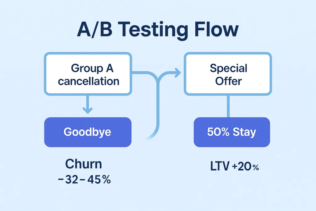
How We Structured the Experiment

We created two groups:

Group A — Control
Users saw the standard cancellation flow with no special incentives.
This included a simple exit survey and a confirmation message.

Group B — Experiment
Users saw a customized paywall with a special offer when they tapped “Cancel Subscription.”
RevenueCat let us configure this screen without building a full custom UI.

We ran the experiment for a full cycle.
Our main metric was LTV, and secondary metrics included:

  • user sentiment
  • cancellation deflection
  • offer acceptance

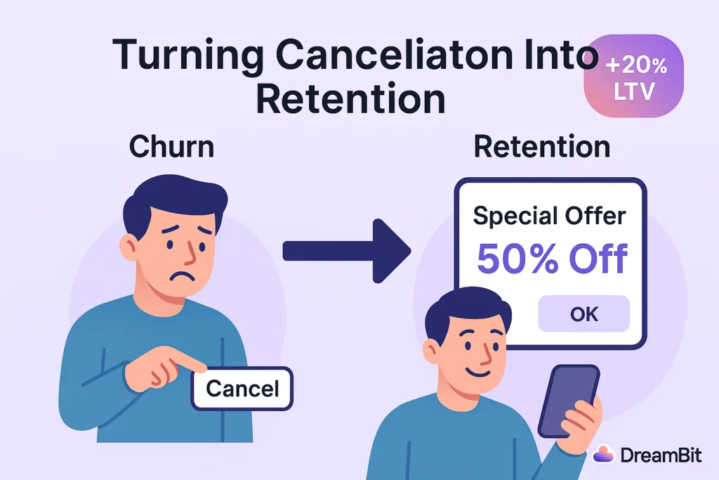
Key Tactic: A Special Offer at the Right Moment

Why the Moment Matters

When users decide to cancel, they are unusually open about their motivations. They are also willing to reconsider if they receive the right message at the right time.
This is why many successful apps offer personalized deals during cancellation.

Real-World Example

Asana does this effectively.
If the app detects that the user is not using the full plan, it offers a cheaper tier instead of a direct cancellation. This transforms a churn moment into a retention opportunity.

What Our Offer Looked Like

When a user in Group B tried to cancel, they saw a friendly message and a deal.
Examples included:

  • “Enjoy the next 3 months at 50% off.”
  • “Try premium features free for one extra month.”

These offers addressed the most common reasons for cancellation:

  • pricing
  • low perceived value
  • lack of feature exploration

If price was the issue, a discount helped.
If value was unclear, extended access to premium features encouraged more engagement.

Technical Implementation

RevenueCat’s offerings let us build a custom paywall that appeared only when a user pressed “Cancel.”

  • For iOS, we used Apple’s promotional offers.
  • For Android, we created a discounted SKU.

We ensured all offers were time-limited.
Discounts applied for a few billing cycles, after which the price returned to normal.


Did It Work? Yes — And Better Than Expected

LTV Increased by 20%

Users who accepted the offer stayed longer and often returned to higher-tier plans later.

Churn Dropped by 32–45%

Compared to a standard cancellation screen, the special offer significantly reduced immediate cancellations.

User Sentiment Improved

The offer felt helpful rather than intrusive.
Users appreciated the tone and clarity of the message.

Not Everyone Stayed – And That’s Fine

Some users still canceled, but the experience remained positive.
We thanked them and kept the door open for a future return.


Lessons Learned

Use Empathetic Messaging

Friendly, supportive language works better than pressure.

Examples:

  • “Budgets can be tight – here’s something that may help.”
  • “If you haven’t tested all features, here’s extended access.”

Keep the Offer Simple

One clear option performs better than multiple buttons.

Add Light Urgency

Time-limited offers drive higher engagement.

Respect the User’s Decision

A positive exit increases the chance of reactivation.


Conclusion: Every Touchpoint Is an Opportunity

One of the biggest takeaways from this cancellation flow case study is simple:
Every user interaction is an opportunity.

Many companies focus heavily on onboarding and “aha” moments. But offboarding can be just as important.
A well-designed cancellation experience reduces churn and increases revenue.
It also leaves a better final impression on users who eventually decide to return.

At DreamBit, we specialize in turning everyday UX flows into growth engines.
If you want to boost your app’s LTV and reduce churn, we’re ready to help.

Learn more about our Projects in our Flutter Optimization Guide

Something to read

LET’S TAKE A LOOK
AT YOUR PROJECT

Eldar Miensutov
Founder
Elsa Braun
Account-manager

Thanks for the information. We will contact with you shortly.