This website uses cookies so that we can provide you with the best user experience possible. Cookie information is stored in your browser and performs functions such as recognising you when you return to our website and helping our team to understand which sections of the website you find most interesting and useful.
If a user can’t find what they’re looking for almost immediately, most likely, they’ll leave your app in a heartbeat. Confusing menus, hidden filters, and a tricky architecture are silently killing conversions.
In this article, we’ll analyze how bad navigation and IA (Information Architecture) hurt your sales and how to fix that with smarter design.
The Problem: Hidden Navigation, Lost Users
Picture this: you open a shopping app, ready to filter by size or price. But the filter button is buried in a vague icon or hidden behind layers of menus. Within seconds, you’re frustrated and thinking: “Where are the filters?”.
Most users won’t hunt for long – they’ll bounce.
We once analyzed an e-commerce app that buried its filters and saw nearly 90% of users leave. The app’s conversion rates decreased drastically because hardly anyone bothered to look for the filter options. Without an easy way to narrow down the catalog, users get overwhelmed or assume you don’t have what they need.
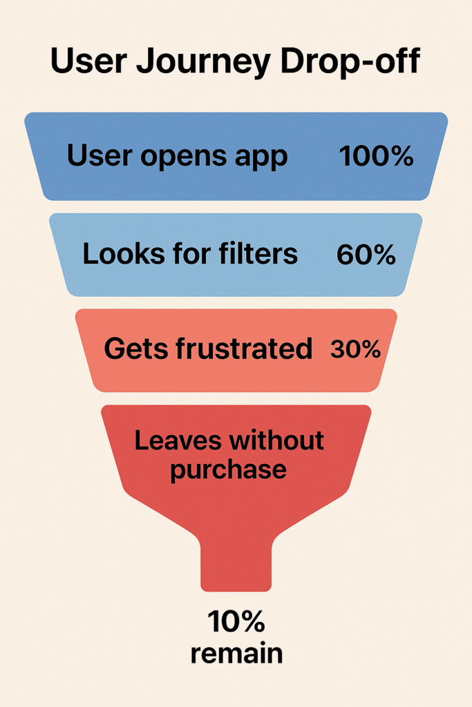
According to Baymard Institute research, only 16% of major e-commerce shops provide a good filtering experience, while the vast majority fail to implement filters well. The rest fail. And pay for it with lost customers.
Often, the root problem is information architecture – how content and categories are structured. For instance, some apps cram everything into one or two menus (forcing users to guess where things are hidden), while others split content into so many subcategories that users don’t even know where to look first. In both cases, users get stuck, frustrated, and leave.
Why are intuitive navigation and good architecture crucial? Because they don’t just make things neat — they make shopping effortless. And effortless journeys lead to fewer abandoned carts, higher conversions, and business growth.
Our Solution: Navigation That Guides, Not Hides
How do we prevent users from dropping off in confusion? The answer is designing navigation that guides users effortlessly, instead of hiding things from them. At Dreambit, we tackle this by focusing on a few core principles:
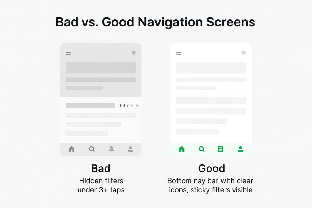
- Make key paths obvious, using persistent bottom navigation.
- Build a clear hierarchy that feels like a logical map, and keep important controls (like filters) easily accessible at all times.
Bottom Navigation Bars – Primary Options, Always Visible
Think of a mobile shopping app with a bottom navigation bar: Home, Categories, Search, Cart, Profile. The icons are clear, always visible, and require zero guesswork.
Unlike a “hamburger” menu, a bottom bar puts the essentials front and center. Users don’t have to remember where things are, and they don’t waste time digging.
Bottom navigation isn’t just about visibility but also about prioritization. It forces you to identify the most important parts of your app (since space is limited to perhaps 3–5 icons), resulting in a cleaner, more focused structure.
Clear Information Hierarchy – A Map Users Can Follow
Navigation gets users in the door, but information architecture (IA) tells them where to go next. IA is essentially the map of your app or site: how content is organized, labeled, and interlinked. A good hierarchy means users intuitively understand where they are and where to go next for what they need.
One of the main UX guidelines is that users should reach what they want in as few taps or clicks as possible (the spirit of the old “3-click rule”). In practice, it’s not about an exact number of clicks but about effort. Every extra step or confusing label is an opportunity for the user to drop off. So, we aim to streamline the paths by reducing unnecessary categories, merging redundant pages, or simply using clearer labels that make sense to the audience.
For instance, in an e-commerce app, having a top-level category called “Clothing” and subcategories like “Men” and “Women” might be more intuitive than burying gender sections first or scattering items by type without a gender filter. The goal is that a new user can predict where things are just by the labels and grouping.
Equally important is avoiding over-structuring your content. While it’s bad to hide everything under one menu, it’s also bad to create dozens of ultra-specific categories.
Research by Baymard Institute warns that overcategorization prevents users from seeing all their options and leads to abandonment. A classic example is a store that separates “Skinny Jeans” and “Slim Jeans” into two categories. Users can struggle because they can’t view all jeans at once and have to jump between categories to compare, often missing items and getting frustrated.
In such cases, a better hierarchy might be to have a single “Jeans” category and let users filter by fit style (skinny, slim, etc.). The principle here is to organize by how users think of the content, not how your internal team thinks of it.
When we design a clear hierarchy, we also pay attention to naming and consistency. If you call your catalog “Shop” in one place and “Products” in another, users pause, second-guess, and lose confidence. A logical, consistent structure keeps them moving forward.
“Sticky” Filters – Refinement at Your Fingertips
Once a user lands in a category or search results, you want to make it effortless for them to refine and drill down to exactly what they want. This is where “sticky” filters come in. A sticky filter is a filter bar or button that stays persistently accessible as the user scrolls through content, rather than disappearing off-screen. The idea is simple: at any point in browsing, the user can adjust filters without having to scroll all the way back up or navigate to a separate filter page.
Why does it matter? Because scrolling back to the top of a 200-item list just to adjust price or size is friction. Friction kills conversions. Sticky filters remove it.
This small UX detail yields real gains. When filters are easy to use, the faster users find the right product. And the faster they find it, the more likely they are to add it to their cart.
Conclusion
Every extra tap, hidden filter, or confusing label can drive users away from your app. Shoppers won’t wait around to figure out how everything works — they’ll shop elsewhere. Clear navigation, smart architecture, and sticky filters are what you need to stay ahead of the competition.
At Dreambit, we help brands transform cluttered, confusing interfaces into smooth, conversion-focused experiences that guide users every step of the way. If you want more sales and fewer abandoned carts, it’s time to rethink how users move through your app.
Ready to turn lost users into loyal customers? Let’s design smarter apps together.
Don’t stop here! Check out our other blog posts for actionable tips on improving your app’s UX, boosting conversions, and delighting users → Read More
