Kseniia Sevostianova
App icon A/B testing is one of the fastest ways to increase organic installs without rebuilding onboarding or spending more on paid traffic. It’s the first thing users see in the app store and a major factor in whether they click through or scroll past. Yet too often, teams choose an icon based on personal taste or branding alone, treating it as “just a logo.” In reality, the app icon is one of the strongest conversion levers. A compelling icon can grab attention in crowded search results and convince more users to check out your app.
Recently, our team used ChatGPT to generate new icon concepts and ran a simple A/B test in the stores. The result? We doubled our weekly organic installs (+100%) in just one week. In this article, we’ll share how we achieved this explosive improvement.
After generating concepts, we validated them with app icon A/B testing in both stores to measure real install conversion uplift.
The Experiment: New Icons via AI and A/B Testing
To boost our app’s install conversion, we ran a structured experiment in three steps, focusing on the app icon:
| Modern app stores (Google Play and Apple’s App Store) allow developers to run A/B tests on visual assets to see which version attracts more users. The app icon is highlighted above as one of the most impactful elements to test. By testing one element at a time (an icon in our case) and running the experiment for at least 7 days, you can get clear, reliable results. |
Step 1. Generate 10 new icon concepts with AI (GPT-5).
Instead of starting in Figma, we started in GPT‑5.
The goal was not to achieve pixel‑perfect design. The goal was to explore the widest possible range of visual directions that could resonate with our audience — without burning design time.
What GPT‑5 helped with:
- Turning our positioning and audience into clear visual directions.
- Translating generic ideas (“modern”, “trustworthy”) into concrete shapes, colors and metaphors.
- Producing 10 distinct icon concepts instead of 2–3 safe variations.
A simplified version of the prompt we used:
“You are a senior mobile app brand designer.
Our app: [short description, category, main value].
Target users: [who they are, what they care about].
Competitors: [2–3 names].
Task: Propose 10 distinct app icon concepts that would stand out in the App Store/Google Play search results for [key search terms].
For each concept, describe:
– Color palette
– Main shape/symbol
– Style (flat/3D/gradient/minimalist, etc.)
– Emotional message (e.g., ‘security’, ‘speed’, ‘fun’)
– Why it would convert.”
From there, we shortlisted the 5–10 most promising ideas tand turned them into production‑ready icon variants.
The key here was quantity and diversity: by generating many different styles, we increased our chances of discovering a high-performing design that we wouldn’t have thought of on our own.
Step 2. Run an A/B test in the App Store/Google Play
Next, we put these AI-generated icons to the test with real users. Both major platforms offer native A/B testing tools for app listings:
- Google Play: Store Listing Experiments
- App Store: Product Page Optimization / Custom Product Pages
We set up an experiment to compare our current icon against several of the new AI-derived icons. Each user who discovered our app in the store would randomly see one of the icon variants. Crucially, we only tested one element at a time – the icon – while keeping everything else (screenshots, description, etc.) the same, to ensure that any difference in install rates would be due to the icon alone. We also followed best practices by letting the test run for a full week to capture weekday vs. weekend user behavior.
During the experiment, we closely monitored the conversion rate (the percentage of store visitors who clicked “Install”) for each icon version. Rather than guess which icon looked “best,” we let users vote with their clicks.
In fact, ASO experts often recommend generating multiple creative variants and then using A/B testing to see which variant drives the highest conversion – and that’s exactly what we did.
Step 3: Pick the Winner and Roll It Out
After seven days, the A/B test had gathered enough data to declare a clear winner. One of the GPT-5 generated icon concepts significantly outperformed the original icon (and the other variants) in conversion rate. Once we identified this winning icon, we swiftly updated our app listing to use it as the official icon for all users.
Afterwards, we still monitored post‑launch metrics for a few days to confirm the uplift holds:
- Organic impressions → installs
- Overall install volume
- Any changes in uninstall rate.
This metric gave us statistical confidence that this variant wasn’t just randomly better, but truly more appealing to users.
The winner from our app icon A/B testing became the new default icon, and organic installs doubled within a week.
Results: +100% Conversion to Install
The impact of the new icon was dramatic. Our app’s conversion rate from store views to installs doubled, increasing by roughly 100% after adopting the AI-generated winner. In practical terms, this meant we unlocked a doubling of our organic growth without spending a cent on additional marketing. For example, if we were getting about 1,000 organic installs per week before, we started seeing around 2,000 installs per week after the change (with the same traffic levels).
The same product, same audience, and same store visibility started delivering twice as many users, purely because the “book cover” finally matched what users were exactly looking for.
Conclusion: Small Changes, Big Wins
Our experiment underscores a powerful lesson for app marketers and product owners: even a small, simple change can yield huge gains. In our case, changing nothing more than the app’s icon led to a 100% increase in conversions.
The new icon clearly resonated better with our target audience. It communicated our app’s value proposition more effectively at a glance, encouraging more people to click and install.
This experiment also highlights the power of AI and A/B testing. GPT-5’s generative ability allowed us to explore new amazing icons, while the app store’s testing tools told us which of them worked best. By combining AI and A/B testing, we tapped into a winning formula. Now, we run similar AI-assisted A/B tests for other aspects of our product’s marketing and UX.
If you want to increase installs without guessing or overspending, we can help you move real metrics.
Churn prediction helps apps spot users who are about to leave – and bring them back with timely, personalized nudges. User churn is one of the biggest threats to sustainability: every abandoned user costs engagement, LTV, referrals, and product learning.
The traditional approach to retention is reactive: companies wait for users to leave, then spend tremendous resources trying to win them back through aggressive campaigns and discounts. This strategy is both expensive and ineffective.
Preventing churn must start early. At DreamBit, we design apps to engage, convert, and retain users, because keeping customers is far more cost-effective than chasing new ones. Let’s explore how our team is transforming user retention through a data-driven, human-centered strategy.
Step 1: The churn prediction framework
What is user churn, and why does it matter?
User churn is simply the percentage of users who stop engaging with your product during a specific time period. To predict churn, you first need to understand user behavior. Dreambit’s approach to retention starts with comprehensive behavioral data collection and analysis. This includes:
| Metrics | Key data points |
| Engagement signals | Session frequency, session duration, active days per week, feature adoption rate |
| Usage patterns | Time since last login, feature frequency, device type, geographic location |
| Interaction depth | In-app purchases, subscription tier, payment history, support tickets opened |
| Feedback & sentiment | App ratings, user reviews, survey responses, NPS scores, support chat sentiment |
This behavioral data is collected passively through app events (clicks, page views, transactions) and analytically through feedback mechanisms. The key is that data collection is continuous, structured, and mapped to business outcomes.
Building the churn prediction model
Once we have clean, organized behavioral data, we build a machine learning model that learns patterns associated with churn. Here’s how it works:
- Feature engineering: We transform raw data into meaningful predictors. For example, instead of raw “days since last login,” create bins like “inactive for 7-14 days” or calculate a “recency decay score” that weights recent inactivity more heavily.
- Class balancing: Churn is typically a rare event (e.g., only 5-10% of users churn in a given month). This imbalance skews models toward predicting “no churn” for everyone. Techniques like SMOTE (Synthetic Minority Oversampling Technique) or weighted loss functions correct this bias.
- Train-test splits: We divide your data chronologically: train on users from months 1-6, validate on month 7, test on month 8. This prevents data leakage and ensures your model generalizes to future data.
- Hyperparameter optimization: Our team uses techniques like Hyperband or grid search to find the best model settings.
A well-tuned churn prediction model typically achieves:
- Precision of 60-70%: Of the users flagged as “at risk,” 60-70% actually churn. This minimizes false alarms and prevents wasteful retention campaigns.
- Recall of 50-60%: The model identifies 50-60% of actual churners before they leave.
- PR AUC (Precision-Recall Area Under Curve) of 0.65-0.75: A metric that balances precision and recall, especially useful when classes are imbalanced.
Defining churn risk segments
Once your model scores users, the next step is to segment them into actionable risk tiers:
| Risk level | Description | Actions required |
| High risk (80-100% churn) | Users showing clear disengagement signals (no activity in 30+ days, negative feedback, downgrades). | Immediate, high-value interventions. |
| Medium risk (50-80%) | Declining engagement, reduced frequency, or missed key milestones. | Re-engagement nudges and value reminders. |
| At-Watch (20-50%) | Early warning signs (not using a key feature, slower adoption, etc.) | Encouragement and education. |
| Stable (0-20%) | Actively engaged, no warning signals. | No intervention needed. |
Step 2: Implementing automated re-engagement workflows
Once you’ve identified at-risk users, the next challenge is engaging them with relevant, timely, non-intrusive messages. Push notifications remain one of the most effective channels for app engagement, but they must be used strategically.
Timing:
- Send notifications when users are most likely to be receptive, typically in the afternoon hours (12 p.m. – 5 p.m.).
- Consider user timezone and local behavior patterns – a fitness app user might respond well to morning motivation, while a e-commerce user might prefer evening shopping time.
- Avoid notification fatigue: Reducing push frequency from daily to once per week decreases unsubscribes by 15%.
Message clarity:
- Keep push notification copy to 10 words or fewer.
- Include clear, action-oriented call-to-action phrases like “Claim Your Offer Now” or “Get 20% Off Today”.
- Emojis can boost open rates by 20% when used appropriately.
Personalization:
- High risk users require messages like “We miss you! 30% off your next purchase – today only.”
- Medium risk customers may need “See what 500K+ users love about [Feature]. Check it out!”
- At-watch users get engaged with simple “Unlock [Benefit] with [Key Feature] in 3 easy steps.”
Note that push notifications should link directly to the specific feature or offer, rather than the app’s homepage. For example, a re-engagement offer should deep-link to the claim page, not require the user to navigate multiple screens. This significantly reduces friction and increases conversion.
Beyond push notifications
While push notifications are powerful, a sophisticated retention strategy should combine multiple channels to reach users where they are.
- Push notifications: Immediate, in-app visibility; highest engagement rate
- In-app messages: Less intrusive than push, can be contextual and personalized
- SMS: High open rates (98%+), effective for time-sensitive offers
- Email: Lower urgency but allows for richer storytelling and multi-step narratives
- Chatbot/Live support: Proactive offer of help for at-risk users (e.g., “Noticed you’re having trouble? Let’s help”)
Step 3: Adopting loyalty programs and long-term retention incentives
In addition to immediate re-engagement offers, our retention strategy includes long-term loyalty programs that reward consistent engagement. These can be:
- Points-based rewards: Every interaction (purchase, review, referral, engagement milestone) earns points redeemable for discounts or exclusive content
- Tier-based status: Bronze → Silver → Gold tiers with escalating perks (discounts, early access, exclusive features, dedicated support)
- Streak rewards: Daily or weekly engagement streaks trigger bonus rewards (common in fitness, education, and productivity apps)
- Exclusive perks: VIP members get early feature access, priority support, or community recognition
- Referral rewards: Users who refer others earn rewards, creating network effects and organic growth
Beyond transactional incentives, retention is fundamentally emotional. Users stay loyal to products that make them feel valued. That’s why we often add personalized greetings, recognition of milestones (“You’ve been with us for 1 year!”), and thoughtful support for our apps.
Typical outcomes from proactive retention programs
After implementing churn prediction and automated re-engagement strategies, organizations typically benefit from the following results.
✅Retention rate improvements: 8-40% increase depending on baseline and program sophistication (fintech and e-commerce see larger gains; B2B SaaS typically 8-15%).
✅Engagement time: 2x-3x increase in daily session duration for users who interact with re-engagement campaigns.
✅Revenue protection: Churn prediction models reduce churn by 10-30%, directly protecting 5-30% of at-risk revenue.
✅Customer lifetime value (LTV): Improved retention multiplies LTV; a 10% retention improvement can increase LTV by 25-50%.
Conclusion: Proactive retention as a strategic advantage
Preventing churn requires prediction and action. By implementing a churn-detection model and coupling it with automated, personalized messaging, you can effectively “plug the leaks” before too many users slip away.
If you’re ready to build a retention engine that keeps your users engaged, reduces churn, and compounds revenue growth, contact us.
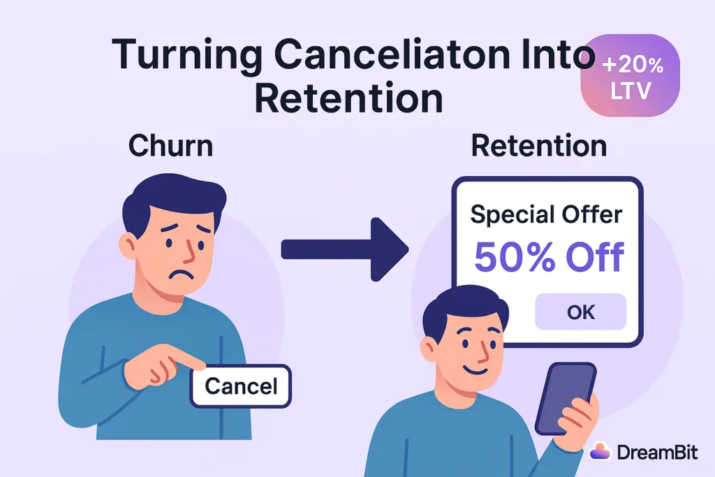
This article is a cancellation flow case study that shows what really happens when a customer tries to leave – and how that moment can become a growth opportunity.
Picture this: a subscriber opens your app, heads to their account, and taps “Cancel Subscription.”
Most companies treat this moment as the end of the road. For them, it means a lost customer.
But should it be?
Some users will always unsubscribe, but you should not let it happen without at least trying to understand their decision. You also should not miss the chance to offer something valuable in return.
At Dreambit, we asked ourselves a simple question:
What if the very screen where users go to leave could convince them to stay?
This idea turned into a system that allowed us to convert an “exit” into an “upsell.”
And it worked.
By creatively monetizing the unsubscribe flow, we boosted our app’s LTV by about 20%.
What You’ll Learn
In this cancellation flow case study, we’ll walk through:
- what lessons we learned along the way
- how we used A/B testing on paywalls
- how we introduced a special offer at the cancellation step
- what results we achieved
In this case study, we explain how we used A/B testing, RevenueCat tools, and a strategically timed “special offer” to turn churn into revenue.
Strategy: A/B Testing Paywalls With RevenueCat
Why We Chose a Data-Driven Approach
When we noticed an issue with churn, we did not rely on guesswork. We needed clear data.
Our approach centered on A/B testing different versions of the cancellation flow. This allowed us to measure what actually improved retention.
Why RevenueCat?
RevenueCat is a popular platform for managing in-app subscriptions on iOS and Android.
It supports:
- paywalls
- experiments
- promotional offers
These tools saved us a lot of development time.
With RevenueCat Experiments, we could show one experience to half of our users and another to the rest. Then we measured which version produced higher retention and LTV.
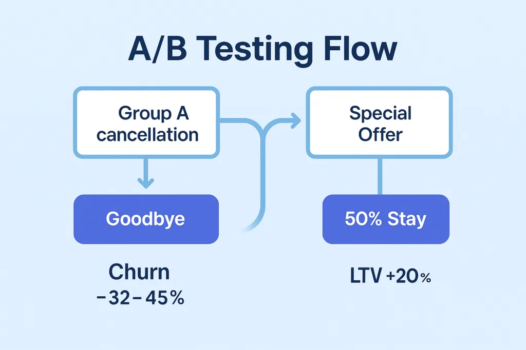
How We Structured the Experiment
We created two groups:
Group A — Control
Users saw the standard cancellation flow with no special incentives.
This included a simple exit survey and a confirmation message.
Group B — Experiment
Users saw a customized paywall with a special offer when they tapped “Cancel Subscription.”
RevenueCat let us configure this screen without building a full custom UI.
We ran the experiment for a full cycle.
Our main metric was LTV, and secondary metrics included:
- user sentiment
- cancellation deflection
- offer acceptance
Key Tactic: A Special Offer at the Right Moment
Why the Moment Matters
When users decide to cancel, they are unusually open about their motivations. They are also willing to reconsider if they receive the right message at the right time.
This is why many successful apps offer personalized deals during cancellation.
Real-World Example
Asana does this effectively.
If the app detects that the user is not using the full plan, it offers a cheaper tier instead of a direct cancellation. This transforms a churn moment into a retention opportunity.
What Our Offer Looked Like
When a user in Group B tried to cancel, they saw a friendly message and a deal.
Examples included:
- “Enjoy the next 3 months at 50% off.”
- “Try premium features free for one extra month.”
These offers addressed the most common reasons for cancellation:
- pricing
- low perceived value
- lack of feature exploration
If price was the issue, a discount helped.
If value was unclear, extended access to premium features encouraged more engagement.
Technical Implementation
RevenueCat’s offerings let us build a custom paywall that appeared only when a user pressed “Cancel.”
- For iOS, we used Apple’s promotional offers.
- For Android, we created a discounted SKU.
We ensured all offers were time-limited.
Discounts applied for a few billing cycles, after which the price returned to normal.
Did It Work? Yes — And Better Than Expected
LTV Increased by 20%
Users who accepted the offer stayed longer and often returned to higher-tier plans later.
Churn Dropped by 32–45%
Compared to a standard cancellation screen, the special offer significantly reduced immediate cancellations.
User Sentiment Improved
The offer felt helpful rather than intrusive.
Users appreciated the tone and clarity of the message.
Not Everyone Stayed – And That’s Fine
Some users still canceled, but the experience remained positive.
We thanked them and kept the door open for a future return.
Lessons Learned
Use Empathetic Messaging
Friendly, supportive language works better than pressure.
Examples:
- “Budgets can be tight – here’s something that may help.”
- “If you haven’t tested all features, here’s extended access.”
Keep the Offer Simple
One clear option performs better than multiple buttons.
Add Light Urgency
Time-limited offers drive higher engagement.
Respect the User’s Decision
A positive exit increases the chance of reactivation.
Conclusion: Every Touchpoint Is an Opportunity
One of the biggest takeaways from this cancellation flow case study is simple:
Every user interaction is an opportunity.
Many companies focus heavily on onboarding and “aha” moments. But offboarding can be just as important.
A well-designed cancellation experience reduces churn and increases revenue.
It also leaves a better final impression on users who eventually decide to return.
At DreamBit, we specialize in turning everyday UX flows into growth engines.
If you want to boost your app’s LTV and reduce churn, we’re ready to help.
Learn more about our Projects in our Flutter Optimization Guide
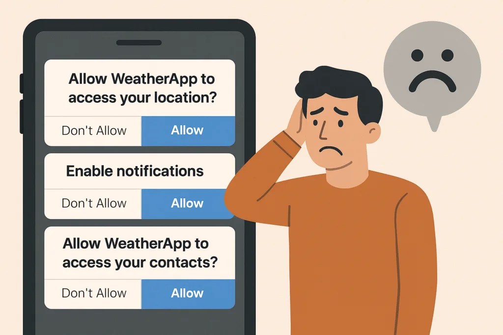
Do you know that the very first moments after downloading an app – including how you handle app permission requests – determine whether users will become loyal customers or hit the uninstall button?
If they’re instantly hit with pop-ups like “Allow access to your location,” “Enable notifications,” or “Rate us 5 stars,” trust evaporates – and so do your users.
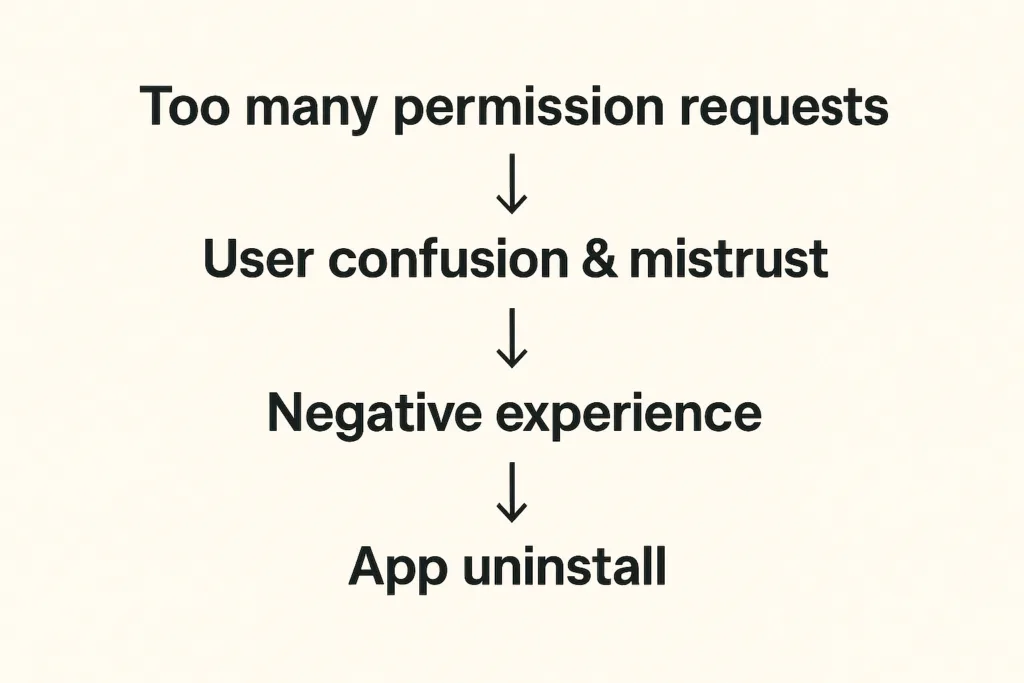
When apps request too many permissions too soon, users fear privacy invasion and data misuse.
For instance, if a weather app asks for camera and microphone access before showing any forecast, users will likely delete it.
This article explores the psychology behind app permission requests and explains how to turn potential frustration into loyalty.
This article delves into the psychology of customers and reveals the best ways to turn them into loyal users rather than drive them away.
The problem: Why app permission requests can destroy user trust
Imagine opening a weather app just to see the forecast. Before anything loads, you face a stack of prompts: location access, notifications, ratings – all in 30 seconds.
You’d feel overwhelmed and suspicious. That’s how 45% of users feel before uninstalling apps that bombard them with early permission requests.
Recent studies reveal:
- 45% of uninstalls are due to unclear permission requests
- 72% of users delete apps they perceive as unsafe or intrusive
Users want control. When apps ask for too much too soon, they lose trust – and you lose retention.
Recent research shows that 45% of app uninstalls stem from unclear permission requests or mistrust around data usage. And things get even worse when apps require access to contacts, camera, microphone, or location without context. Modern app users are increasingly privacy-conscious – another survey indicates that 72% of users won’t hesitate to uninstall apps because they fear their personal data will be misused.
How can we avoid these pitfalls?
The solution: How to make app permission requests contextual and user-friendly
The answer is to ask less – and ask smarter. When developing an app, we always try to align permission prompts with user actions and needs:
- Request permissions only when needed. Smart apps wait until the user tries to use a feature before requesting the permission. For instance, a weather app can ask for location only when the user taps “Find local weather”. This contextual approach feels natural and respectful.
| Real-life example: Instagram doesn’t request camera access during onboarding. Instead, it waits until users tap the camera icon to create their first post. At that moment, the permission request makes perfect sense — users understand exactly why it’s needed and what benefit they’ll receive |
- If a permission is critical upfront, educate the user first. Some apps do need a core permission from the very beginning – for example, a navigation app genuinely cannot function without GPS location. In such cases, it’s ok to ask for location early but in the right way: clearly communicate why you need this access and how it benefits the user.
| Real-life example Starbucks demonstrates sophisticated contextual permission design by explaining how location access enables timely offers when users are near stores. By linking the permission directly to tangible benefits (personalized promotions at the right moment) they achieve significantly higher acceptance rates. |
- Space out requests and prioritize the essentials. Avoid piling on multiple prompts back-to-back. If you need several different permissions, consider their importance and timing. Ask for the most crucial one first and save less vital ones for later when relevant.
- Give users control over notifications. Notifications are useful for engagement if done right, but a top reason for uninstalls if overdone. The best practice is to let users decide the kind of notifications they want and how often. Inside your app’s settings, provide toggles or preferences – for example, the user could choose to receive daily summary alerts, severe weather warnings only, or no notifications at all. This way, users will feel the app respects their attention and needs.
- Ask for app ratings and other opt-ins at the right moment. A common mistake is prompting for an app store rating too soon – sometimes on first launch. Instead, time your rating requests to when a user has achieved something or shown satisfaction. For example, after a user has checked the weather for a week straight or engaged with multiple features, a gentle pop-up like “Enjoying the app? Tap to rate us!” is more likely to be well-received.
In essence, our solution is about respecting the user’s journey.
The framework: Best practices for handling app permission requests
For development teams, implementing such a permission strategy requires a systematic approach. Here’s our framework on how to do it right.
| Audit phase | List every permission your app requestsIdentify which are essential vs. nice-to-haveDetermine the exact moment each permission becomes necessary |
| Design phase | Create custom pre-permission dialogs explaining the “why”Design fallback experiences for users who deny permissionsImplement progressive onboarding that defers non-critical requests |
| Testing phase | Monitor permission acceptance rates by type and timingTrack correlation between permission requests and uninstallsGather user feedback on permission explanations |
| Compliance phase | Ensure all requests comply with App Store and Play Store guidelinesDocument data usage clearly in privacy policiesProvide easy-to-access permission management settings |
Key takeaways for developers:
- Request permissions contextually, at the moment users need the related feature
- Provide clear, benefit-focused explanations before system permission dialogs
- Design graceful fallbacks for users who deny permissions
- Monitor acceptance rates and uninstall correlations to optimize timing
- Enable user control through in-app permission management settings
Conclusion: Ask permission when the benefits are obvious
Request permission when users understand the value, not when it’s convenient for your code architecture.
This core principle transforms annoying permission requests into opportunities – moments to demonstrate respect for user privacy while showcasing your app’s value. Ask for permission when the benefit is obvious, explain why it matters, and respect their decisions. When users feel that you’re not spamming them with tricky notifications, they reward you with loyalty… and yes, maybe even that 5-star rating when the time is right!
At DreamBit, we can help you design an app that feels intuitive, respectful, and transparent from the very first tap. So, let’s build an app your users will want to say “Allow” to!
Teaser: extra steps = lost customers.
Imagine this scenario: your potential customer has already chosen a product, added it to their cart, and is ready to pay – then suddenly disappears. Sound familiar? This is exactly why finding ways to reduce cart abandonment has become a top priority for every e-commerce brand.
According to the latest research, 70% of online shopping carts are abandoned, and on mobile devices, this figure reaches a staggering 85%. The biggest loss occurs precisely at the checkout stage – almost 1 in 5 shoppers quit because the checkout is too long or complex. Nearly as many drop out when a site forces them to create an account.
The truth is that every unnecessary step on the path to purchase is lost money.
We took this to heart when analyzing one of our e-commerce app projects. The goal was clear: simplify the checkout flow to remove friction. By doing so, we managed to plug a big leak in the funnel and cut the cart abandonment rate by about 20%.
The problem in detail
Before sharing our solutions, let’s explore the typical problems users face during checkout in most e-commerce applications.
The checkout stage is where most brands fail to reduce cart abandonment, mainly due to friction and unnecessary steps.
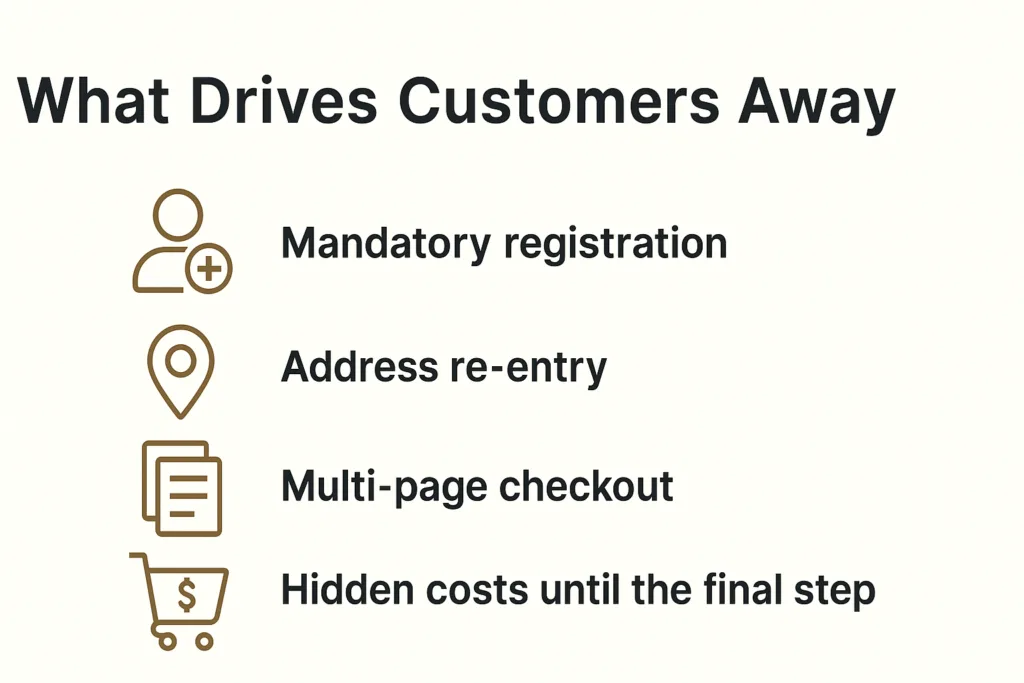
Mandatory registration
Baymard Institute research shows that 24% of users are ready to abandon their cart if the app requires creating an account. When you remove mandatory registration, you can save many more customers. Why? Customers want to quickly buy a product, not create another account with a password they’ll forget in a week.
Address re-entry
Many platforms force users to enter their shipping address, and then enter it again for billing. Even when addresses are identical, the system doesn’t offer automatic copying. This creates frustration and increases checkout time.
Multi-page checkout
Traditional 3-4 page checkout processes force users to click “Next” multiple times, wait for each page to load, and never see the finish line. Every click is an opportunity for the user to change their mind.
Hidden costs until the final step
48% of buyers abandon their cart due to unexpected costs. When these costs appear only on the final checkout page, it creates a feeling of deception and leads to immediate abandonment.
Our Solution: Minimalism That Helps Reduce Cart Abandonment
At DreamBit, our UX improvements directly helped reduce cart abandonment by simplifying the checkout flow and removing friction points.
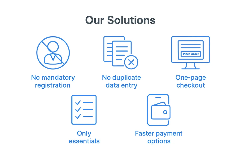
No mandatory registration
We remove the “create an account” roadblock. New customers can check out as guests without signing up. We still collect an email for receipt and allow account creation after purchase, but we no longer force it upfront. This can remove a huge barrier for first-time buyers. What’s more important: making a sale or making a user account? Obviously, the sale.
This change alone can have a significant impact – even industry leaders like ASOS saw 50% more customers complete checkout after they added a guest checkout option. We follow the same principle so that nothing stops a willing customer from paying.
No duplicate data entry
Many apps force users to enter their shipping address, then re-enter it as a billing address (unless they notice a tiny checkbox). We fixed that by defaulting billing = shipping and only asking for an address once. Customers can still adjust it if needed, but the typical buyer now fills out a single address form one time. We also typically enable address auto-complete to speed this up.
By eliminating redundant forms, we shave off an entire page of the checkout process. Fewer form fields means less friction – Baymard Institute’s research shows an ideal checkout only needs about 7–8 fields, yet the average app’s checkout has around 15 fields. We took that lesson and ran with it, asking only for the essentials: shipping info, email, and payment details. Nothing more.
One-page checkout
We consolidated multiple steps into a single page. Previously, our checkout was split into separate pages for shipping, payment, review, etc., each with its own load time and chance to drop off. Now, it’s all presented in one cohesive page (on one screen in the app). The moment a user decides to check out, they see a one-page form where they can enter an address, choose shipping, input payment, and hit “Place Order”. There’s no clicking “Next” and waiting for another page to load.
This streamlined UX makes the process feel faster and simpler. In fact, reducing the number of steps/screens directly boosts conversion. Our apps simply don’t give users a chance to second-guess with extra clicks.
Only essentials
Beyond the big structural changes, we scrutinize every element on the checkout screen. Anything not essential to completing the purchase can be cut. We often remove promotional banners, navigation menus, and any links that could divert the user’s attention. This way, the checkout page turns into a focused, distraction-free zone – essentially a dead-end whose only way out is a successful order.
No more “About Us” links or product recommendations to lure users away at the last moment. We also drop optional fields like “Company Name” or survey questions that could be nice-to-have for us but roadblocks for the user. The checkout UI should be clean and minimal, asking only what’s needed to get the order in the books.
Faster payment options
We integrate one-tap payment methods like Apple Pay and Google Pay. These let users skip the manual entry of card details and billing address entirely, if they choose. Offering such express checkout options further streamlines the experience – for instance, adding digital wallet payments can significantly lift conversion rates (one study noted a 10.7% increase after adding an express payment option).
In our case, a large portion of the app’s users are on mobile, so enabling Apple/Google Pay means many can check out with literally a single tap using stored credentials. The checkout went from a laborious form to a one-click affair.
Improvements at a glance
These changes clearly demonstrate how a focused approach to reducing cart abandonment impacts conversions and checkout speed.
| Before changes | After changes | Improvement | |
| Cart abandonment rate | 68% | 48% | -20% |
| Checkout conversion | 54% | 65% | +20% |
| Checkout completion time | 4.2 min | 1.8 min | -57% |
| Mobile conversion | 2.1% | 3.4% | +62% |
The bottom line: The best checkout is an invisible checkout
The best checkout experience is invisible – one that naturally reduces cart abandonment and helps customers complete their purchase effortlessly.
In a world where user attention costs more than advertising budget, every second in checkout is critically important. Our experience shows that removing even one unnecessary step can increase conversions by 5-10%.
The best checkout is one that users don’t notice. They simply buy the product and enjoy the process.
If your e-commerce project needs similar optimization, DreamBit is ready to help create a checkout that converts visitors into customers.