Kseniia Sevostianova
If a user can’t find what they’re looking for almost immediately, most likely, they’ll leave your app in a heartbeat. Confusing menus, hidden filters, and a tricky architecture are silently killing conversions.
In this article, we’ll analyze how bad navigation and IA (Information Architecture) hurt your sales and how to fix that with smarter design.
The Problem: Hidden Navigation, Lost Users
Picture this: you open a shopping app, ready to filter by size or price. But the filter button is buried in a vague icon or hidden behind layers of menus. Within seconds, you’re frustrated and thinking: “Where are the filters?”.
Most users won’t hunt for long – they’ll bounce.
We once analyzed an e-commerce app that buried its filters and saw nearly 90% of users leave. The app’s conversion rates decreased drastically because hardly anyone bothered to look for the filter options. Without an easy way to narrow down the catalog, users get overwhelmed or assume you don’t have what they need.
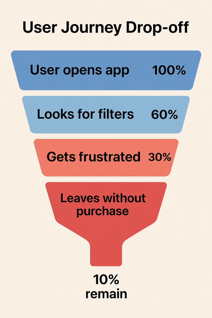
According to Baymard Institute research, only 16% of major e-commerce shops provide a good filtering experience, while the vast majority fail to implement filters well. The rest fail. And pay for it with lost customers.
Often, the root problem is information architecture – how content and categories are structured. For instance, some apps cram everything into one or two menus (forcing users to guess where things are hidden), while others split content into so many subcategories that users don’t even know where to look first. In both cases, users get stuck, frustrated, and leave.
Why are intuitive navigation and good architecture crucial? Because they don’t just make things neat — they make shopping effortless. And effortless journeys lead to fewer abandoned carts, higher conversions, and business growth.
Our Solution: Navigation That Guides, Not Hides
How do we prevent users from dropping off in confusion? The answer is designing navigation that guides users effortlessly, instead of hiding things from them. At Dreambit, we tackle this by focusing on a few core principles:
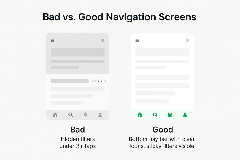
- Make key paths obvious, using persistent bottom navigation.
- Build a clear hierarchy that feels like a logical map, and keep important controls (like filters) easily accessible at all times.
Bottom Navigation Bars – Primary Options, Always Visible
Think of a mobile shopping app with a bottom navigation bar: Home, Categories, Search, Cart, Profile. The icons are clear, always visible, and require zero guesswork.
Unlike a “hamburger” menu, a bottom bar puts the essentials front and center. Users don’t have to remember where things are, and they don’t waste time digging.
Bottom navigation isn’t just about visibility but also about prioritization. It forces you to identify the most important parts of your app (since space is limited to perhaps 3–5 icons), resulting in a cleaner, more focused structure.
Clear Information Hierarchy – A Map Users Can Follow
Navigation gets users in the door, but information architecture (IA) tells them where to go next. IA is essentially the map of your app or site: how content is organized, labeled, and interlinked. A good hierarchy means users intuitively understand where they are and where to go next for what they need.
One of the main UX guidelines is that users should reach what they want in as few taps or clicks as possible (the spirit of the old “3-click rule”). In practice, it’s not about an exact number of clicks but about effort. Every extra step or confusing label is an opportunity for the user to drop off. So, we aim to streamline the paths by reducing unnecessary categories, merging redundant pages, or simply using clearer labels that make sense to the audience.
For instance, in an e-commerce app, having a top-level category called “Clothing” and subcategories like “Men” and “Women” might be more intuitive than burying gender sections first or scattering items by type without a gender filter. The goal is that a new user can predict where things are just by the labels and grouping.
Equally important is avoiding over-structuring your content. While it’s bad to hide everything under one menu, it’s also bad to create dozens of ultra-specific categories.
Research by Baymard Institute warns that overcategorization prevents users from seeing all their options and leads to abandonment. A classic example is a store that separates “Skinny Jeans” and “Slim Jeans” into two categories. Users can struggle because they can’t view all jeans at once and have to jump between categories to compare, often missing items and getting frustrated.
In such cases, a better hierarchy might be to have a single “Jeans” category and let users filter by fit style (skinny, slim, etc.). The principle here is to organize by how users think of the content, not how your internal team thinks of it.
When we design a clear hierarchy, we also pay attention to naming and consistency. If you call your catalog “Shop” in one place and “Products” in another, users pause, second-guess, and lose confidence. A logical, consistent structure keeps them moving forward.
“Sticky” Filters – Refinement at Your Fingertips
Once a user lands in a category or search results, you want to make it effortless for them to refine and drill down to exactly what they want. This is where “sticky” filters come in. A sticky filter is a filter bar or button that stays persistently accessible as the user scrolls through content, rather than disappearing off-screen. The idea is simple: at any point in browsing, the user can adjust filters without having to scroll all the way back up or navigate to a separate filter page.
Why does it matter? Because scrolling back to the top of a 200-item list just to adjust price or size is friction. Friction kills conversions. Sticky filters remove it.
This small UX detail yields real gains. When filters are easy to use, the faster users find the right product. And the faster they find it, the more likely they are to add it to their cart.
Conclusion
Every extra tap, hidden filter, or confusing label can drive users away from your app. Shoppers won’t wait around to figure out how everything works — they’ll shop elsewhere. Clear navigation, smart architecture, and sticky filters are what you need to stay ahead of the competition.
At Dreambit, we help brands transform cluttered, confusing interfaces into smooth, conversion-focused experiences that guide users every step of the way. If you want more sales and fewer abandoned carts, it’s time to rethink how users move through your app.
Ready to turn lost users into loyal customers? Let’s design smarter apps together.
Don’t stop here! Check out our other blog posts for actionable tips on improving your app’s UX, boosting conversions, and delighting users → Read More
The first minutes with your app decide whether new users activate or disappear. Most drop-offs happen here because of the onboarding process that creates friction: too many steps, early data requests, long tutorials, or verification walls. The statistics are sobering – organizations experience abandonment rates of up to 40% during onboarding.
This guide reveals the key mistakes in the onboarding process, gives actionable tips on how to avoid them, and provides successful examples from leading apps.
The Hidden Cost of Friction
The thorough research by ABBYY reveals that the factors contributing most to onboarding abandonment include:

The cost of these leaks is huge. Not only do you lose users, but you also waste the acquisition cost for each lost customer. Companies report that reducing abandonment rates by just 50% could increase customer acquisition by 29% and boost revenue by 26%.
A classic broken flow might look like this:

If your onboarding process is driving users away, it’s not the users who are the problem — it’s the process. Treat a high drop-off rate as a sign that your onboarding might indeed be a leaky bucket, and start seeking out those leaks.
Adopting a progressive onboarding approach is like applying sealant to that bucket.
What Is Progressive Onboarding?
If traditional onboarding dumps every requirement and feature on users at once, progressive onboarding does the opposite. It’s a strategy of gradually introducing your app’s value and only asking for user commitment when necessary.
Instead of forcing new sign-ups to fill out lengthy forms, go through extensive tutorials, or configure every setting on day 1, progressive onboarding aims to give users a quick win first.

For example, if your app’s core value is editing photos, let the user edit a photo right away instead of making them watch a tutorial about every tool. If your service is a chat platform, let them send a message and get a reply (the basic value) before you bombard them with channel setup or profile customization.
The great examples of apps with progressive onboarding include:
| Duolingo: Experience First, Commit LaterDuolingo embraces progressive onboarding by letting users start learning immediately without any sign-up required. New users complete an interactive lesson translating words, experience early success, and only then are invited to create an account. This “try before you register” approach has helped Duolingo become one of the most successful educational apps globally. |
| Uber Eats: Registration at the Right MomentUber Eats takes a similarly strategic approach, requesting registration only during the payment process. Users can browse restaurants, build their order, and only when they’re ready to pay – when they’ve already invested time and made a decision – are they asked to register. This timing dramatically improves conversion because the user has already committed to the purchase. |
Why Progressive Onboarding Really Works
Progressive onboarding works because it aligns with how humans process information and make decisions. By presenting information in carefully planned stages, you reduce cognitive load and prevent user overwhelm.
Key principles of progressive onboarding include:
- Show only essential options initially – avoid feature overload
- Make progression obvious – users should know how to access more features
- Provide contextual education – teach users about features when they need them
- Delay complex decisions – authentication, detailed profiles, and advanced settings can wait.
Best Practices for Progressive Onboarding
Designing a progressive onboarding flow requires thought and iteration. Below, we have narrowed down the best tips and practices to help turn a leaky onboarding funnel into an engaging experience:
Identify the core action that delivers value, and get users to it fast
Trim any steps before this “aha moment” down to the bare minimum. Whether it’s creating a first note in a productivity app or making a first search in a travel app, let users do it almost immediately. Everything else (profiles, settings, secondary features) can come later.
Break onboarding into bite-sized chunks
Instead of one long tutorial or form, use step-by-step disclosure. Ask for info incrementally and offer guidance in context. For example, use tooltips or hints at the moment a user reaches a feature that needs explanation, rather than explaining all features in a front-loaded tour. This keeps the experience relevant and reduces cognitive overload.
Make registration feel worth it
If you must ask users to sign up or provide personal data, time it strategically. Ideally, prompt sign-up right after the user has experienced value or when it’s needed to proceed (like saving progress or checking out). Clearly communicate what the user gains by registering – for instance, “Create an account to save your history and sync across devices.” Framing the benefit helps justify the ask.
Allow exploration in “guest mode”
Where feasible, let users try the app without an account (even if with limited functionality). This lowers the entry barrier. As we saw in practice, guest checkout and no-login previews can capture users who would bounce at a login wall, thus increasing overall conversion. You can always encourage account creation later with gentle prompts or incentives such as “Save your progress by signing up – it’s quick!”.
Continuously monitor and optimize
Treat onboarding as an area of ongoing improvement, not a one-time set-and-forget project. To optimize your progressive onboarding strategy, monitor these critical metrics:
- Time to first value: How quickly users experience your core benefit
- Step-by-step conversion rates: Where exactly users drop off
- Feature adoption rates: Which features users engage with first
- Registration conversion: Percentage of users who eventually register
- Customer lifetime value: Long-term value of progressively onboarded users
Conclusion
By implementing these practices, you can “plug the holes” in your onboarding bucket and turn hard-won sign-ups into happy, active customers. They enjoy a quick, rewarding first experience, and you retain a much larger portion of them than before.
At Dreambit, we’ve seen firsthand how optimizing onboarding flows can boost activation, retention, and revenue across different industries. From wellness apps to e-commerce platforms, our team has helped clients cut unnecessary friction and design progressive experiences that keep users engaged from day one.
If you’re planning to launch a new app or want to fix an onboarding funnel that’s leaking users, we’re here to help. Our experts can analyze your current flow, suggest improvements, and build onboarding experiences that convert curiosity into long-term loyalty.
👉 Let’s talk about how Dreambit can help you build an app with onboarding that works for your business, not against it.
Wellness App Development with Flutter: CSE+ Case Study 2025
The market for wellness app development with Flutter is booming. It is expected to surge from $13.09B in 2025 to $26.19B in 2030. This 14.9% annual growth shows how consumers now embrace digital health and fitness tools.
A strong example is Clean Simple Eats (CSE+) — a wellness brand that transformed its e-commerce business into a full digital ecosystem. In just 2 months of MVP development on Flutter, CSE+ secured 9,000 monthly active users and proved that combining nutrition, macro tracking, and shopping in one app is a winning strategy.
Why Flutter Leads Wellness App Development
The Dreambit team selected Flutter as the core technology because it supports rapid wellness app development across iOS and Android. Benefits in 2025 include:
- Near-native performance with a bridgeless architecture
- 40–60% savings on development costs
- Faster release cycles with hot reload
- A large developer community and plugin ecosystem
Flutter’s cross-platform capabilities delivered a perfect 50/50 user split between iOS and Android, making it ideal for health and wellness products.
Key Technological Features in Wellness App Development with Flutter
One of the biggest challenges of CSE+ was combining wellness features with monetization — delivering everything from healthy meal planning to in-app purchasing.
🥗 Automated Meal & Grocery Planning
The app automatically generates shopping lists based on selected meal plans, turning recipes into ready-to-buy ingredient lists.
🤖 AI-Powered Personalization
Machine learning delivers personalized meal plans based on user goals, allergies, and diet preferences.
📊 Macro Tracking with Smart Inputs
- Barcode scanning
- Voice recognition
- 800+ macro-friendly recipes
- Trend charts and progress visuals to drive engagement
UX/UI Design for High Retention
CSE+ applies empathetic, accessible design — calming colors, stress-free navigation, and reminders built around healthy motivation instead of pressure. The UI also supports larger fonts, high contrast, and screen reader access to make the app inclusive.
Results & Business Impact
CSE+ drove impressive business outcomes:
- 19% conversion from free → paid users
- 4 minute session duration (industry benchmark)
- 4 sessions per user per day
- D1 retention: 30%, D7: 17%, D30: 7%
This allowed Clean Simple Eats to migrate its audience from a classic e-commerce model to a powerful community-driven ecosystem — where content, commerce, and community live inside one app.
Market Growth & Competitors
- Wellness apps dominate 31% of the mHealth niche in 2023
- Android holds 56% market share → Flutter gives perfect reach
- Key competitors include Herbalife, Bulletproof & Natural Force, but CSE+ stands out through full funnel integration
Tech Trends in 2025
- Flutter cross-platform is now nearly native in performance
- AI personalization drives dynamic coaching, intelligent diet changes, and adaptive wellness journeys
- E-commerce + wellness fusion becomes a main competitive edge
Conclusion
CSE+ showcases what next-gen wellness app development with Flutter can achieve: an engaging, accessible, personalized ecosystem that boosts both user outcomes and business revenue.
With the wellness app market projected to hit $26.19B by 2030, businesses that combine AI, commerce, and Flutter-powered speed will shape the future of health technology.
👉 Want to see the full project?
Check out the live case here: https://www.dreambit.tech/Clean-Simple-Eats-your-all-in-one-healthy-companion-2dbd6ede16d045ec847c3a052622bcd5
For more examples of Flutter-based products, explore our Flutter app development project.
Starting a project with Dreambit, the initial couple of weeks are the most significant.
A few steps that we do to reach up to 30% of the project completion:
• focus on the precision and compatibilty
• planning before even a single line of code is created
We initiate by jumping into your objectives and the issue that you want to be resolved. Revealing all the “why” points allows to construct the vision and set up success criteria.
Within the current phase, we make key documents like the project initiation document and business case. These give broad areas like scope, timeline, risks, budget, team roles, and act as the roadmap for the development journey.
Through a couple of discussions, we get the functional and non-functional necessities to direct design and development correctly.
At the same point, we make a decision concerning:
• technical approach
• architecture
• picking up the best technologies be it Flutter, React, React Native, or others leaning on your goals, budget, and time.
Finally, we implement the following things:
• project management tools for proper tasks monitoring and deadline prioritization
• version control and best practices for the software development lifecycle
• testing frameworks to be convenient and release quality work right from the start
This approach reduces possible risks and sets the project towards success.
At Dreambit, we believe that right software starts with great amount of preparation and planning.
Friends, the Dreambit staff has something to talk about that tends to be forgotten when it comes to creating a mobile application: the life of the application after it goes live. Everyone focuses on the launch, but success begins afterward.
𝐖𝐡𝐲 𝐝𝐨𝐞𝐬 𝐦𝐚𝐢𝐧𝐭𝐚𝐢𝐧𝐢𝐧𝐠 𝐚𝐩𝐩𝐬 𝐫𝐞𝐦𝐚𝐢𝐧 𝐬𝐨 𝐢𝐦𝐩𝐨𝐫𝐭𝐚𝐧𝐭? ⚙️
Envision buying a car and never having it serviced. How long would it last? The same applies to mobile apps.
Our own experience bears this out: projects we maintain for a year following release add an average of 43% more active users to their base compared to those abandoned without updates.
𝐖𝐡𝐚𝐭 𝐝𝐨𝐞𝐬 𝐦𝐚𝐢𝐧𝐭𝐚𝐢𝐧𝐢𝐧𝐠 𝐚 𝐦𝐨𝐛𝐢𝐥𝐞 𝐚𝐩𝐩𝐥𝐢𝐜𝐚𝐭𝐢𝐨𝐧 𝐢𝐧𝐯𝐨𝐥𝐯𝐞? 🔧
Let us consider the principal factors involved in quality maintenance:
1. Technical Maintenance
• API and server monitoring
• Error diagnosis and correction for different users
• Enhancing performance and resource utilization
• Staying current with new versions of iOS and Android
2. Functionality Improvements
• Implementing new features based on user feedback
• Designing core functions for better usability
• Adapting to new market and user specifications
• Embracing new technologies (e.g., our new path in AI)
𝐇𝐨𝐰 𝐨𝐟𝐭𝐞𝐧 𝐬𝐡𝐨𝐮𝐥𝐝 𝐲𝐨𝐮 𝐮𝐩𝐝𝐚𝐭𝐞 𝐲𝐨𝐮𝐫 𝐚𝐩𝐩? 📱
The optimal update frequency depends on the type of app, but our experience suggests the following recommendations:
• Critical patches — right away
• Functional updates — every 2-4 weeks
• Significant interface updates — every 3-6 months
• Full redesign — every 1.5-2 years
𝐌𝐚𝐢𝐧𝐭𝐞𝐧𝐚𝐧𝐜𝐞 𝐂𝐨𝐬𝐭𝐬: 𝐖𝐡𝐚𝐭 𝐭𝐨 𝐄𝐱𝐩𝐞𝐜𝐭? 💸
Most clients underestimate the budget required for maintenance. Based on our experience, the annual maintenance budget typically ranges between 15-30% of the initial development cost.
One of our e-commerce clients allocated 20% of their development cost to maintenance over the year and saw an 87% increase in app revenue.
𝐌𝐚𝐢𝐧𝐭𝐞𝐧𝐚𝐧𝐜𝐞 𝐏𝐥𝐚𝐧𝐧𝐢𝐧𝐠: 𝐖𝐡𝐞𝐧 𝐭𝐨 𝐒𝐭𝐚𝐫𝐭? 📊
One of the biggest mistakes businesses make is thinking about maintenance only after launch. In reality, planning for maintenance should begin during the development process.
At Dreambit, our approach includes:
• Preparing documentation for developers
• Setting up an error monitoring system
• Integrating analytical tools
• Developing an update strategy for the first 6 months
Thank you for staying with us until the end!