Kseniia Sevostianova
This article is a cancellation flow case study that shows what really happens when a customer tries to leave – and how that moment can become a growth opportunity.
Picture this: a subscriber opens your app, heads to their account, and taps “Cancel Subscription.”
Most companies treat this moment as the end of the road. For them, it means a lost customer.
But should it be?
Some users will always unsubscribe, but you should not let it happen without at least trying to understand their decision. You also should not miss the chance to offer something valuable in return.
At Dreambit, we asked ourselves a simple question:
What if the very screen where users go to leave could convince them to stay?
This idea turned into a system that allowed us to convert an “exit” into an “upsell.”
And it worked.
By creatively monetizing the unsubscribe flow, we boosted our app’s LTV by about 20%.
What You’ll Learn
In this cancellation flow case study, we’ll walk through:
- what lessons we learned along the way
- how we used A/B testing on paywalls
- how we introduced a special offer at the cancellation step
- what results we achieved
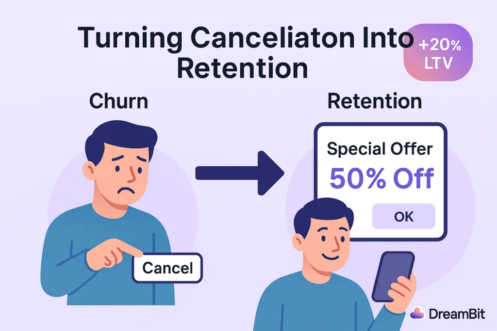
In this case study, we explain how we used A/B testing, RevenueCat tools, and a strategically timed “special offer” to turn churn into revenue.
Strategy: A/B Testing Paywalls With RevenueCat
Why We Chose a Data-Driven Approach
When we noticed an issue with churn, we did not rely on guesswork. We needed clear data.
Our approach centered on A/B testing different versions of the cancellation flow. This allowed us to measure what actually improved retention.
Why RevenueCat?
RevenueCat is a popular platform for managing in-app subscriptions on iOS and Android.
It supports:
- paywalls
- experiments
- promotional offers
These tools saved us a lot of development time.
With RevenueCat Experiments, we could show one experience to half of our users and another to the rest. Then we measured which version produced higher retention and LTV.
How We Structured the Experiment
We created two groups:
Group A — Control
Users saw the standard cancellation flow with no special incentives.
This included a simple exit survey and a confirmation message.
Group B — Experiment
Users saw a customized paywall with a special offer when they tapped “Cancel Subscription.”
RevenueCat let us configure this screen without building a full custom UI.
We ran the experiment for a full cycle.
Our main metric was LTV, and secondary metrics included:
- user sentiment
- cancellation deflection
- offer acceptance
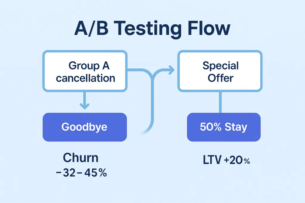
Key Tactic: A Special Offer at the Right Moment
Why the Moment Matters
When users decide to cancel, they are unusually open about their motivations. They are also willing to reconsider if they receive the right message at the right time.
This is why many successful apps offer personalized deals during cancellation.
Real-World Example
Asana does this effectively.
If the app detects that the user is not using the full plan, it offers a cheaper tier instead of a direct cancellation. This transforms a churn moment into a retention opportunity.
What Our Offer Looked Like
When a user in Group B tried to cancel, they saw a friendly message and a deal.
Examples included:
- “Enjoy the next 3 months at 50% off.”
- “Try premium features free for one extra month.”
These offers addressed the most common reasons for cancellation:
- pricing
- low perceived value
- lack of feature exploration
If price was the issue, a discount helped.
If value was unclear, extended access to premium features encouraged more engagement.
Technical Implementation
RevenueCat’s offerings let us build a custom paywall that appeared only when a user pressed “Cancel.”
- For iOS, we used Apple’s promotional offers.
- For Android, we created a discounted SKU.
We ensured all offers were time-limited.
Discounts applied for a few billing cycles, after which the price returned to normal.
Did It Work? Yes — And Better Than Expected
LTV Increased by 20%
Users who accepted the offer stayed longer and often returned to higher-tier plans later.
Churn Dropped by 32–45%
Compared to a standard cancellation screen, the special offer significantly reduced immediate cancellations.
User Sentiment Improved
The offer felt helpful rather than intrusive.
Users appreciated the tone and clarity of the message.
Not Everyone Stayed – And That’s Fine
Some users still canceled, but the experience remained positive.
We thanked them and kept the door open for a future return.
Lessons Learned
Use Empathetic Messaging
Friendly, supportive language works better than pressure.
Examples:
- “Budgets can be tight – here’s something that may help.”
- “If you haven’t tested all features, here’s extended access.”
Keep the Offer Simple
One clear option performs better than multiple buttons.
Add Light Urgency
Time-limited offers drive higher engagement.
Respect the User’s Decision
A positive exit increases the chance of reactivation.
Conclusion: Every Touchpoint Is an Opportunity
One of the biggest takeaways from this cancellation flow case study is simple:
Every user interaction is an opportunity.
Many companies focus heavily on onboarding and “aha” moments. But offboarding can be just as important.
A well-designed cancellation experience reduces churn and increases revenue.
It also leaves a better final impression on users who eventually decide to return.
At DreamBit, we specialize in turning everyday UX flows into growth engines.
If you want to boost your app’s LTV and reduce churn, we’re ready to help.
Learn more about our Projects in our Flutter Optimization Guide
Do you know that the very first moments after downloading an app – including how you handle app permission requests – determine whether users will become loyal customers or hit the uninstall button?
If they’re instantly hit with pop-ups like “Allow access to your location,” “Enable notifications,” or “Rate us 5 stars,” trust evaporates – and so do your users.
When apps request too many permissions too soon, users fear privacy invasion and data misuse.
For instance, if a weather app asks for camera and microphone access before showing any forecast, users will likely delete it.
This article explores the psychology behind app permission requests and explains how to turn potential frustration into loyalty.
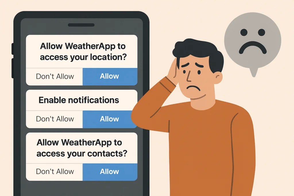
This article delves into the psychology of customers and reveals the best ways to turn them into loyal users rather than drive them away.
The problem: Why app permission requests can destroy user trust
Imagine opening a weather app just to see the forecast. Before anything loads, you face a stack of prompts: location access, notifications, ratings – all in 30 seconds.
You’d feel overwhelmed and suspicious. That’s how 45% of users feel before uninstalling apps that bombard them with early permission requests.
Recent studies reveal:
- 45% of uninstalls are due to unclear permission requests
- 72% of users delete apps they perceive as unsafe or intrusive
Users want control. When apps ask for too much too soon, they lose trust – and you lose retention.
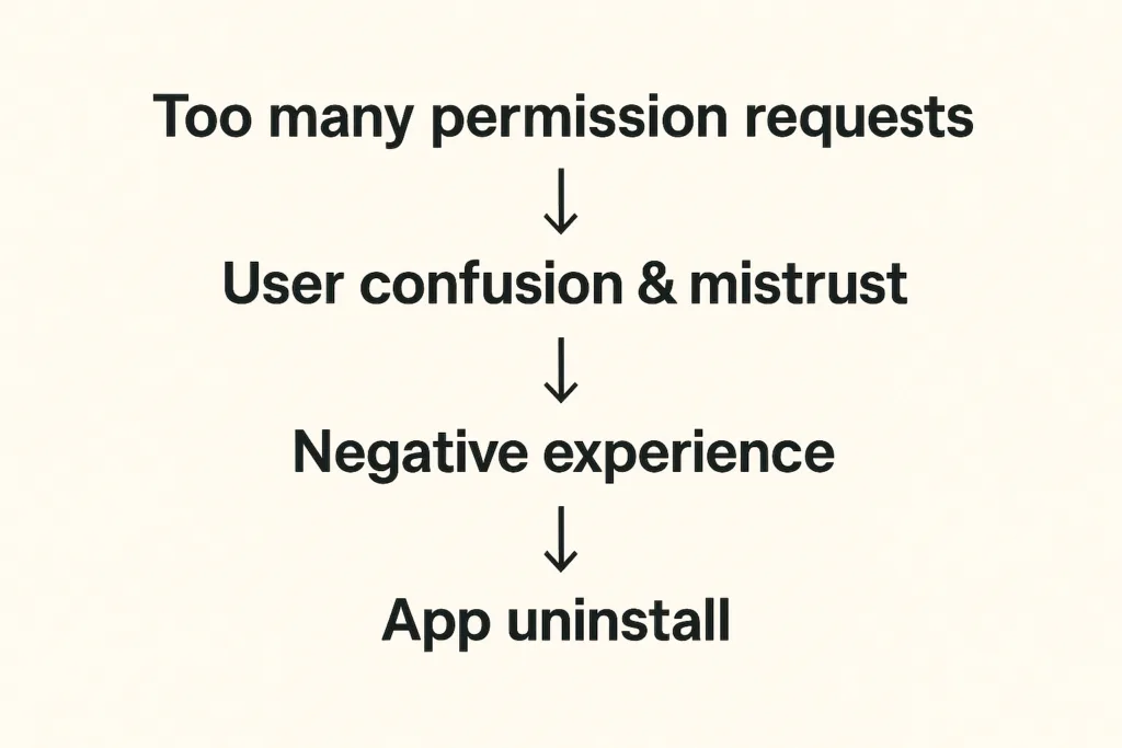
Recent research shows that 45% of app uninstalls stem from unclear permission requests or mistrust around data usage. And things get even worse when apps require access to contacts, camera, microphone, or location without context. Modern app users are increasingly privacy-conscious – another survey indicates that 72% of users won’t hesitate to uninstall apps because they fear their personal data will be misused.
How can we avoid these pitfalls?
The solution: How to make app permission requests contextual and user-friendly
The answer is to ask less – and ask smarter. When developing an app, we always try to align permission prompts with user actions and needs:
- Request permissions only when needed. Smart apps wait until the user tries to use a feature before requesting the permission. For instance, a weather app can ask for location only when the user taps “Find local weather”. This contextual approach feels natural and respectful.
| Real-life example: Instagram doesn’t request camera access during onboarding. Instead, it waits until users tap the camera icon to create their first post. At that moment, the permission request makes perfect sense — users understand exactly why it’s needed and what benefit they’ll receive |
- If a permission is critical upfront, educate the user first. Some apps do need a core permission from the very beginning – for example, a navigation app genuinely cannot function without GPS location. In such cases, it’s ok to ask for location early but in the right way: clearly communicate why you need this access and how it benefits the user.
| Real-life example Starbucks demonstrates sophisticated contextual permission design by explaining how location access enables timely offers when users are near stores. By linking the permission directly to tangible benefits (personalized promotions at the right moment) they achieve significantly higher acceptance rates. |
- Space out requests and prioritize the essentials. Avoid piling on multiple prompts back-to-back. If you need several different permissions, consider their importance and timing. Ask for the most crucial one first and save less vital ones for later when relevant.
- Give users control over notifications. Notifications are useful for engagement if done right, but a top reason for uninstalls if overdone. The best practice is to let users decide the kind of notifications they want and how often. Inside your app’s settings, provide toggles or preferences – for example, the user could choose to receive daily summary alerts, severe weather warnings only, or no notifications at all. This way, users will feel the app respects their attention and needs.
- Ask for app ratings and other opt-ins at the right moment. A common mistake is prompting for an app store rating too soon – sometimes on first launch. Instead, time your rating requests to when a user has achieved something or shown satisfaction. For example, after a user has checked the weather for a week straight or engaged with multiple features, a gentle pop-up like “Enjoying the app? Tap to rate us!” is more likely to be well-received.
In essence, our solution is about respecting the user’s journey.
The framework: Best practices for handling app permission requests
For development teams, implementing such a permission strategy requires a systematic approach. Here’s our framework on how to do it right.
| Audit phase | List every permission your app requestsIdentify which are essential vs. nice-to-haveDetermine the exact moment each permission becomes necessary |
| Design phase | Create custom pre-permission dialogs explaining the “why”Design fallback experiences for users who deny permissionsImplement progressive onboarding that defers non-critical requests |
| Testing phase | Monitor permission acceptance rates by type and timingTrack correlation between permission requests and uninstallsGather user feedback on permission explanations |
| Compliance phase | Ensure all requests comply with App Store and Play Store guidelinesDocument data usage clearly in privacy policiesProvide easy-to-access permission management settings |
Key takeaways for developers:
- Request permissions contextually, at the moment users need the related feature
- Provide clear, benefit-focused explanations before system permission dialogs
- Design graceful fallbacks for users who deny permissions
- Monitor acceptance rates and uninstall correlations to optimize timing
- Enable user control through in-app permission management settings
Conclusion: Ask permission when the benefits are obvious
Request permission when users understand the value, not when it’s convenient for your code architecture.
This core principle transforms annoying permission requests into opportunities – moments to demonstrate respect for user privacy while showcasing your app’s value. Ask for permission when the benefit is obvious, explain why it matters, and respect their decisions. When users feel that you’re not spamming them with tricky notifications, they reward you with loyalty… and yes, maybe even that 5-star rating when the time is right!
At DreamBit, we can help you design an app that feels intuitive, respectful, and transparent from the very first tap. So, let’s build an app your users will want to say “Allow” to!
Teaser: extra steps = lost customers.
Imagine this scenario: your potential customer has already chosen a product, added it to their cart, and is ready to pay – then suddenly disappears. Sound familiar? This is exactly why finding ways to reduce cart abandonment has become a top priority for every e-commerce brand.
According to the latest research, 70% of online shopping carts are abandoned, and on mobile devices, this figure reaches a staggering 85%. The biggest loss occurs precisely at the checkout stage – almost 1 in 5 shoppers quit because the checkout is too long or complex. Nearly as many drop out when a site forces them to create an account.
The truth is that every unnecessary step on the path to purchase is lost money.
We took this to heart when analyzing one of our e-commerce app projects. The goal was clear: simplify the checkout flow to remove friction. By doing so, we managed to plug a big leak in the funnel and cut the cart abandonment rate by about 20%.
The problem in detail
Before sharing our solutions, let’s explore the typical problems users face during checkout in most e-commerce applications.
The checkout stage is where most brands fail to reduce cart abandonment, mainly due to friction and unnecessary steps.
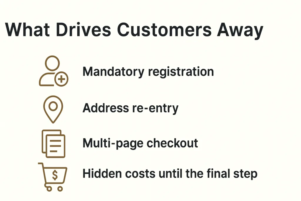
Mandatory registration
Baymard Institute research shows that 24% of users are ready to abandon their cart if the app requires creating an account. When you remove mandatory registration, you can save many more customers. Why? Customers want to quickly buy a product, not create another account with a password they’ll forget in a week.
Address re-entry
Many platforms force users to enter their shipping address, and then enter it again for billing. Even when addresses are identical, the system doesn’t offer automatic copying. This creates frustration and increases checkout time.
Multi-page checkout
Traditional 3-4 page checkout processes force users to click “Next” multiple times, wait for each page to load, and never see the finish line. Every click is an opportunity for the user to change their mind.
Hidden costs until the final step
48% of buyers abandon their cart due to unexpected costs. When these costs appear only on the final checkout page, it creates a feeling of deception and leads to immediate abandonment.
Our Solution: Minimalism That Helps Reduce Cart Abandonment
At DreamBit, our UX improvements directly helped reduce cart abandonment by simplifying the checkout flow and removing friction points.
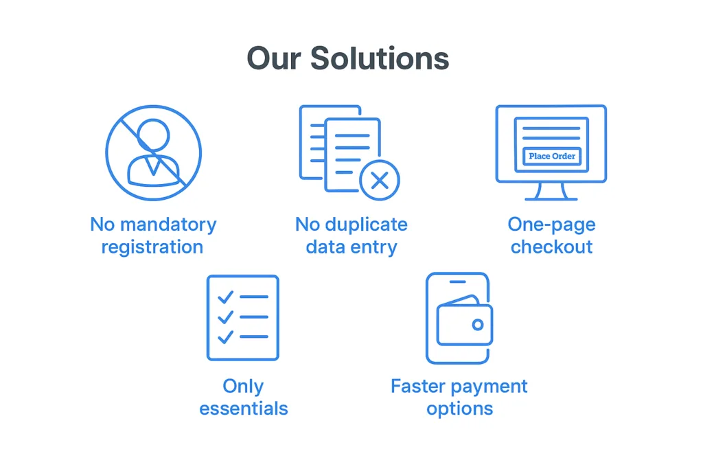
No mandatory registration
We remove the “create an account” roadblock. New customers can check out as guests without signing up. We still collect an email for receipt and allow account creation after purchase, but we no longer force it upfront. This can remove a huge barrier for first-time buyers. What’s more important: making a sale or making a user account? Obviously, the sale.
This change alone can have a significant impact – even industry leaders like ASOS saw 50% more customers complete checkout after they added a guest checkout option. We follow the same principle so that nothing stops a willing customer from paying.
No duplicate data entry
Many apps force users to enter their shipping address, then re-enter it as a billing address (unless they notice a tiny checkbox). We fixed that by defaulting billing = shipping and only asking for an address once. Customers can still adjust it if needed, but the typical buyer now fills out a single address form one time. We also typically enable address auto-complete to speed this up.
By eliminating redundant forms, we shave off an entire page of the checkout process. Fewer form fields means less friction – Baymard Institute’s research shows an ideal checkout only needs about 7–8 fields, yet the average app’s checkout has around 15 fields. We took that lesson and ran with it, asking only for the essentials: shipping info, email, and payment details. Nothing more.
One-page checkout
We consolidated multiple steps into a single page. Previously, our checkout was split into separate pages for shipping, payment, review, etc., each with its own load time and chance to drop off. Now, it’s all presented in one cohesive page (on one screen in the app). The moment a user decides to check out, they see a one-page form where they can enter an address, choose shipping, input payment, and hit “Place Order”. There’s no clicking “Next” and waiting for another page to load.
This streamlined UX makes the process feel faster and simpler. In fact, reducing the number of steps/screens directly boosts conversion. Our apps simply don’t give users a chance to second-guess with extra clicks.
Only essentials
Beyond the big structural changes, we scrutinize every element on the checkout screen. Anything not essential to completing the purchase can be cut. We often remove promotional banners, navigation menus, and any links that could divert the user’s attention. This way, the checkout page turns into a focused, distraction-free zone – essentially a dead-end whose only way out is a successful order.
No more “About Us” links or product recommendations to lure users away at the last moment. We also drop optional fields like “Company Name” or survey questions that could be nice-to-have for us but roadblocks for the user. The checkout UI should be clean and minimal, asking only what’s needed to get the order in the books.
Faster payment options
We integrate one-tap payment methods like Apple Pay and Google Pay. These let users skip the manual entry of card details and billing address entirely, if they choose. Offering such express checkout options further streamlines the experience – for instance, adding digital wallet payments can significantly lift conversion rates (one study noted a 10.7% increase after adding an express payment option).
In our case, a large portion of the app’s users are on mobile, so enabling Apple/Google Pay means many can check out with literally a single tap using stored credentials. The checkout went from a laborious form to a one-click affair.
Improvements at a glance
These changes clearly demonstrate how a focused approach to reducing cart abandonment impacts conversions and checkout speed.
| Before changes | After changes | Improvement | |
| Cart abandonment rate | 68% | 48% | -20% |
| Checkout conversion | 54% | 65% | +20% |
| Checkout completion time | 4.2 min | 1.8 min | -57% |
| Mobile conversion | 2.1% | 3.4% | +62% |
The bottom line: The best checkout is an invisible checkout
The best checkout experience is invisible – one that naturally reduces cart abandonment and helps customers complete their purchase effortlessly.
In a world where user attention costs more than advertising budget, every second in checkout is critically important. Our experience shows that removing even one unnecessary step can increase conversions by 5-10%.
The best checkout is one that users don’t notice. They simply buy the product and enjoy the process.
If your e-commerce project needs similar optimization, DreamBit is ready to help create a checkout that converts visitors into customers.
Let’s be honest – most of us don’t live in places with flawless internet. We’re constantly in elevators, trains, and crowded cafes with spotty Wi-Fi. Yet too many apps still assume a perfect connection. The moment the signal drops, they freeze, crash, or even worse – lose your data.
This article shows why offline-first apps are a must-have now and how strong offline support can boost user trust, retention, and long-term business growth.
Wi-Fi fiasco: No signal, no data
Picture this: you’re taking quick notes during a meeting. Suddenly, the network cuts out. The app you trusted doesn’t save locally, and your thoughts vanish. Users on forums have shared stories like “more than half of a detailed work note disappeared”.
This isn’t just an inconvenience. For professionals, it’s lost work, lost time, and often a lost reason to keep the app installed.
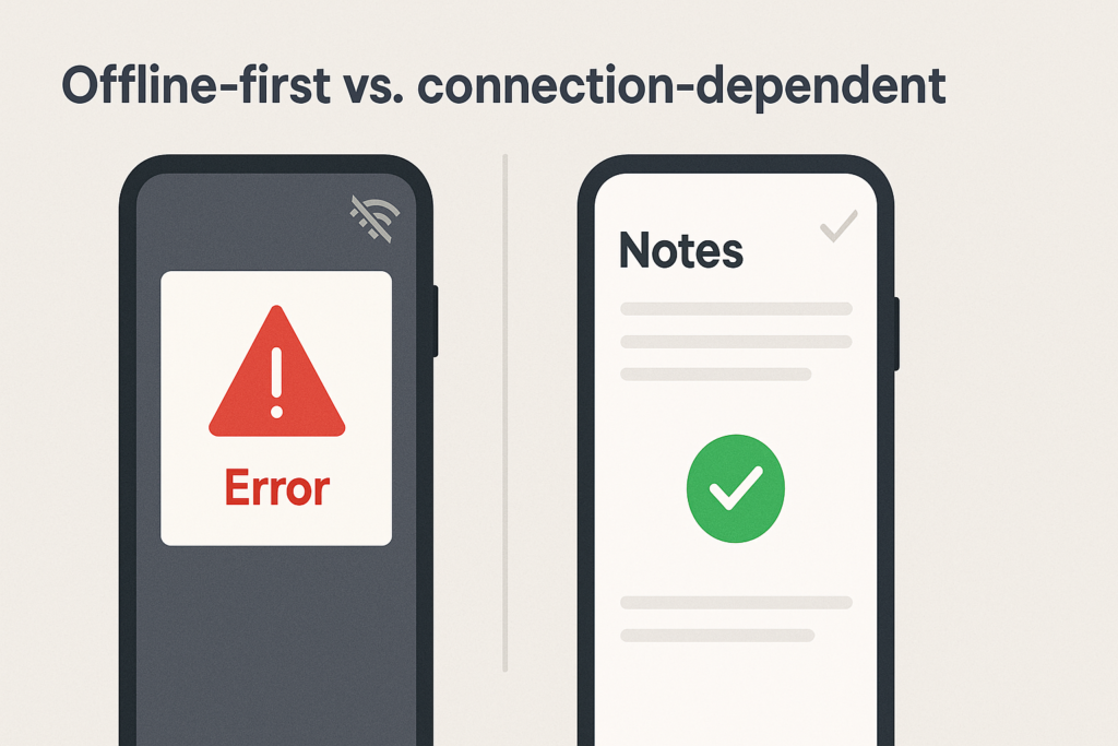
Such situations are not limited to note‑taking. Podcasts, health trackers, social apps, and field‑service tools all suffer when offline functionality is poor.
Research backs it up: nearly 3 out of 4 users have seen apps lose data during offline moments. Around 80% will stop using an app if it doesn’t handle poor connectivity well.
How can the offline-first approach transform your app?
On the contrary, if your app has robust offline functionality, you can benefit from:
- Higher user retention rates as users trust the app to work everywhere
- Increased session duration since connectivity interruptions don’t end usage
- Positive app store ratings highlighting reliability and user-centric design
- Organic growth through satisfied users who experienced seamless functionality
- Fewer support tickets related to data loss and synchronization issues
- Lower server costs due to optimized data transfer and caching.
At DreamBit, we understand that delivering a smooth offline experience isn’t optional – it’s essential. Our team specializes in creating apps that work flawlessly, whether users are in a basement with no signal or on a mountaintop with perfect connectivity.
| DreamBit has hands-on experience implementing offline features. Our Everfm project lets users enjoy uninterrupted podcast experiences regardless of network conditions, with automatic syncing ensuring their listening history and preferences are always up-to-date across devices. Read more → |
Here’s how we follow an offline‑first philosophy and provide seamless user experiences.
Using a local database as the primary source
Our offline‑first apps operate on local data (SQLite, Room, Hive, etc.), treating the database as the source of truth. When the user writes a note, updates their profile, or adds a task, the change is immediately stored locally, ensuring that the UI remains responsive even without the internet.
Caching content and assets
By caching previously loaded screens, images, and files, we empower users to continue browsing while offline. For note‑taking, this means caching note lists and attachments so they remain viewable even during disconnection. For example, in our Everfm app, caching ensures that discovered podcasts and downloaded episodes stay accessible offline.

Queueing and syncing changes intelligently
When offline, we queue user actions (new notes, edits, deletes) locally and mark them for synchronization. Once the device reconnects, a sync manager sends only the changed data to the server, reducing network load and battery consumption. We support both one‑way sync for read‑only feeds (e.g., news) and two‑way sync with conflict resolution for collaborative tools like note‑taking apps.
Handling conflicts and merging
When a user edits a note offline and another user edits the same note online, conflicts can occur. We implement conflict‑resolution strategies (last‑write‑wins, versioning or merge UI prompts), ensuring data integrity across devices.
Detecting connectivity and managing transitions
We make sure that when connection is lost, the app switches to offline mode and provides clear messaging. When connectivity returns, the app syncs and notifies the user. This helps avoid silent failures.
Providing manual controls and feedback
Users appreciate transparency. We offer offline status indicators, manual sync buttons and progress feedback during data sync. This reassures users that their data is safe and can sync automatically.
Securing and optimizing local data
To protect sensitive notes, we encrypt local caches and optimize them for minimal storage and battery impact. Intelligent storage management cleans up stale caches and allows users to delete downloaded content when space runs low.
Take note that at DreamBit, we design offline-first. This means:
- Every feature is evaluated for offline usability from the design phase
- Data architecture is built to work seamlessly with or without connectivity
- User interfaces adapt intelligently to provide clear feedback about the offline status
- Synchronization is automatic and transparent, requiring no user intervention.
Conclusion: reliable offline mode is a game-changer
When users can trust that their data is safe and accessible regardless of connectivity, your app becomes indispensable rather than disposable.
At DreamBit, we can help you create experiences that users can depend on anywhere, anytime. Ready to build an app that never lets your users down? Contact us to discuss your project.
Teaser: Trust begins with consistency
First impressions happen fast – about 50 milliseconds is enough. In that blink of an eye, an inconsistent or chaotic interface can trigger a negative reaction and send users away from your app.
Think about it: if one page of your app looks sleek and modern, but the next is made in mismatched colors and fonts, users immediately feel something is off. Design consistency isn’t just about aesthetics; it’s about making your audience feel comfortable and confident in your brand. If your branding is “all over the place,” customers won’t trust you – and if they don’t trust you, they won’t buy from you.
Maintaining a cohesive, well-organized design is key to turning users into loyal customers. Just as we instantly recognize the familiar colors and fonts of brands like Apple or Nike, a consistent design can help people recognize and trust your brand at a glance.
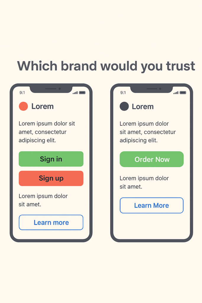
The Problem: When Design Chaos Reigns
Imagine an app that has the large green oval “Order Now” button on the home screen. But on the checkout screen, it offers a small red square button for the same action. On one page, icons are flat and minimalist; on another, they’re detailed and colorful. It feels like each part of the app was designed by a different team that never spoke to each other. Yikes!
Inconsistent design forces users to stop and second-guess, figuring everything out again instead of moving forward smoothly. Over time, this confusion breeds frustration. One UX expert described it perfectly: “If every button and menu behaves differently, the user must constantly relearn how to interact with the app. Predictability – a critical aspect of usability – is lost. When users can’t rely on familiar patterns or a stable layout, they feel uneasy and even alienate”.
Worst of all, inconsistency erodes trust in the product. People perceive a sloppy interface as a sign of unreliability. It makes your app (and by extension, your company) seem unprofessional. Studies in UX design reveal that a cluttered design can make your product feel unreliable. Users might wonder, “If they can’t even get their app’s look and feel together, can I trust them with my order or my data?” That doubt can be fatal.
Confused and unsure, users may abandon the app entirely and go to competitors that “feel” more put-together. As a result, you may end with lost users, lost sales, and a damaged reputation.
Our Solution: Consistency Through a Design System
So, how do you prevent this kind of design chaos and ensure every interaction with your brand inspires confidence? The answer is simple but powerful: implement a comprehensive design system.
At Dreambit, we are big believers in this approach. In fact, when kicking off a new project, we insist on creating a design system right from the start.
A design system acts as the ultimate rulebook and toolkit for your brand’s visuals and user experience. It typically includes defined standards for typography, color palettes, icon styles, spacing, button designs, and more – basically, all the building blocks of your UI. It can also cover UX rules like how certain interactions should behave or how error messages should appear.
In short, it’s a holistic guide that ensures every piece of your product’s interface is consistent, from the smallest icon to the entire layout.
By establishing a design system, you create a unified visual language for your brand. And when users navigate your app, they encounter a predictable experience: every page looks like it belongs to the same family, every element behaves as expected. As a result, the whole app feels professional and reliable, which naturally strengthens your brand’s reputation.
There’s another huge benefit to using a design system: it saves time, money, and countless headaches in the long run. Without a clear system, teams often waste their resources reinventing UI elements or correcting mistakes.
We’ve all seen projects where a lack of standards leads to “design debt” – dozens of slightly different buttons and layouts that eventually all have to be fixed or unified in a costly redesign (even minor changes require updates across multiple unique components). This is the scenario we desperately want to avoid.
When you invest a bit of effort upfront to create a well-thought-out system, you save your time, money, and effort on endless revisions in the long run.
Another point to note is that having a design system doesn’t mean your design will be boring. On the contrary, it frees up your creative energy for what truly matters. Instead of spending time deciding basic things over and over, your team can focus on unique improvements.
Conclusion: Design Systems – Not a Constraint, but a Worthy Investment
Chaos in design is a silent killer of customer confidence in your brand. Every inconsistent button, odd color switch, or off-brand page makes users hesitate and doubt.
We’ve seen that trust is hard to earn and incredibly easy to lose. The good news is that chaos is avoidable. By prioritizing consistency through a design system, you lay the groundwork for a user experience that feels smooth, reliable, and true to your brand on every screen.
Ultimately, a design system is not about putting your design in a cage. It’s an invaluable investment in speed and quality – you streamline your design and development process, while ensuring a higher quality, more polished result every time.
At Dreambit, we help businesses build products that don’t just look great but inspire trust through consistency. Get in touch with us to make something meaningful together.
Don’t stop here! Check out our other blog posts for actionable tips on improving your app’s UX, boosting conversions, and delighting users → Read More